

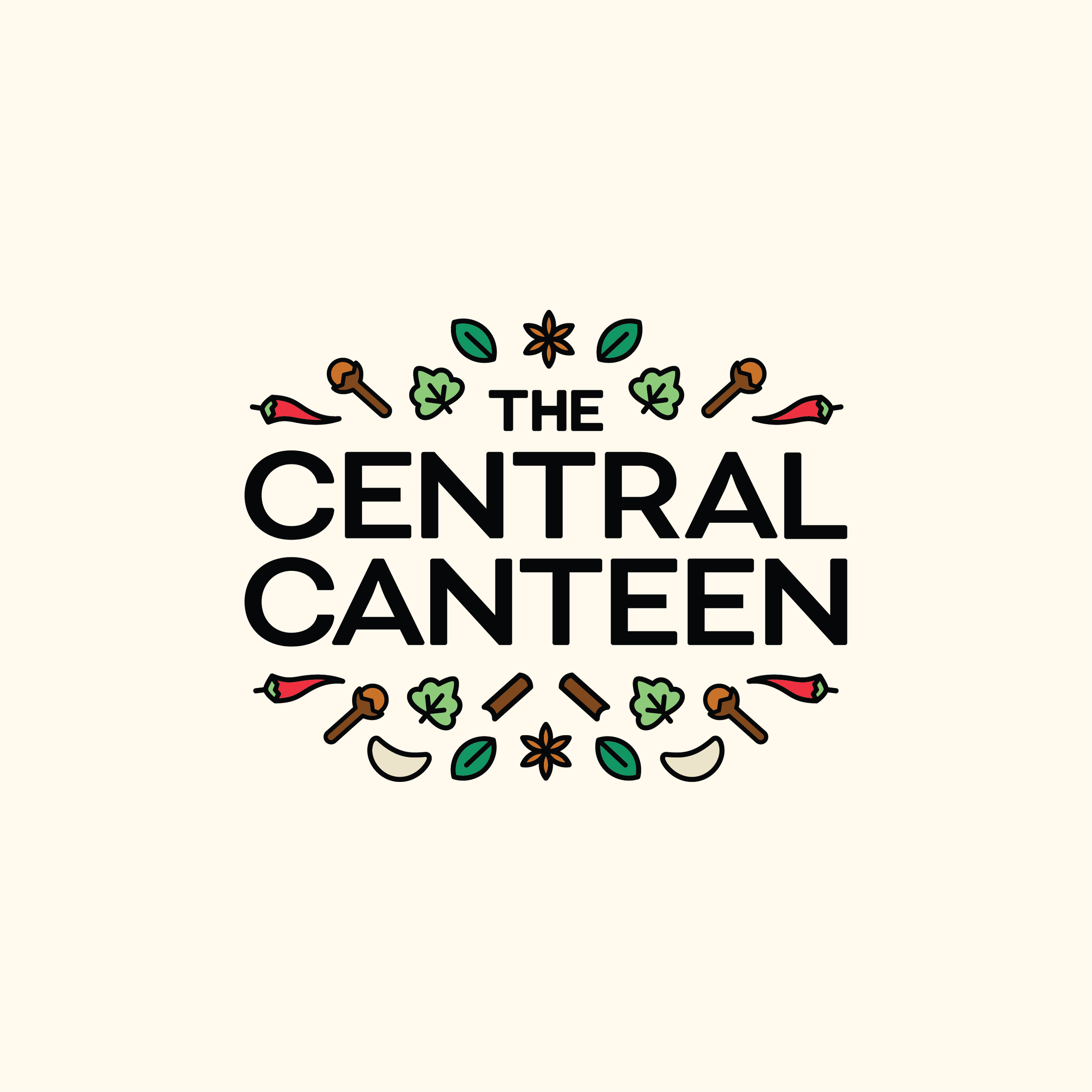
The Central Canteen
The co-founders had a vision of quick-service pan-Indian food served at economical rates in a central and busy street in Bangalore - Commercial Street. Known for its thousands of shops spread across the meandering roads, this part of the city is well known for constant shopping foot traffic, street food, and a limited number of restaurants.
They wanted to seize the opportunity and offer weary shoppers a respite, as well as an affordable option for the innumerable staff and office goers in the area. To keep the menu interesting, the intention was to have the base menu standard and play with the native preparations. A gravy from South India one week, and the same gravy with a North Indian flavor the following week.
The branding expectations were a combination of fine lines of balance.
Indian, modern, warm, and welcoming.
Scope
-
Brand Story
Brand Identity
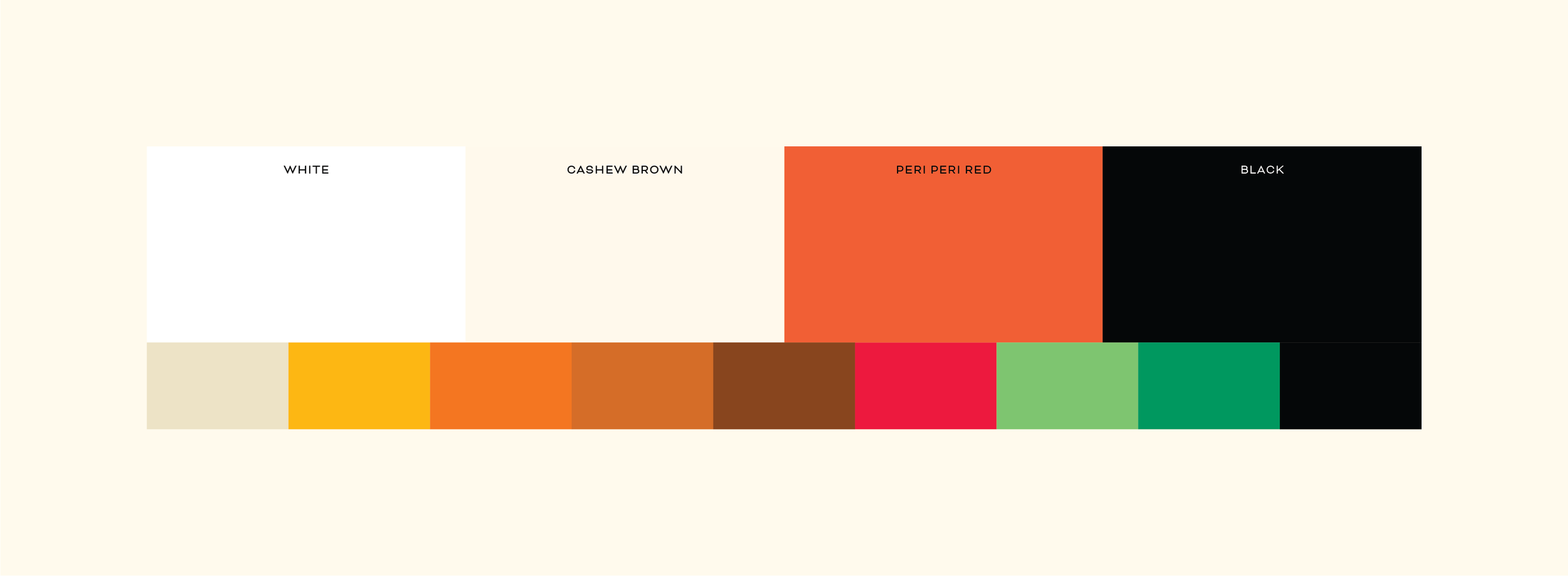
Colour palette
Typography
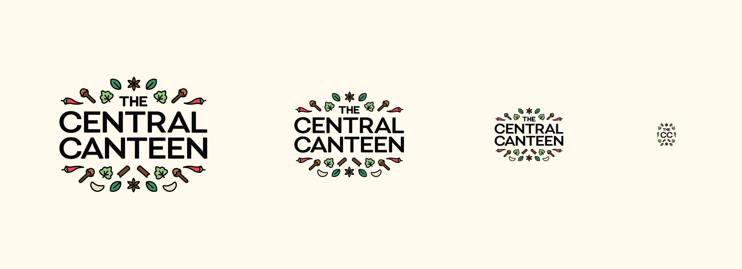
Logo Orientations
Brand Guidelines
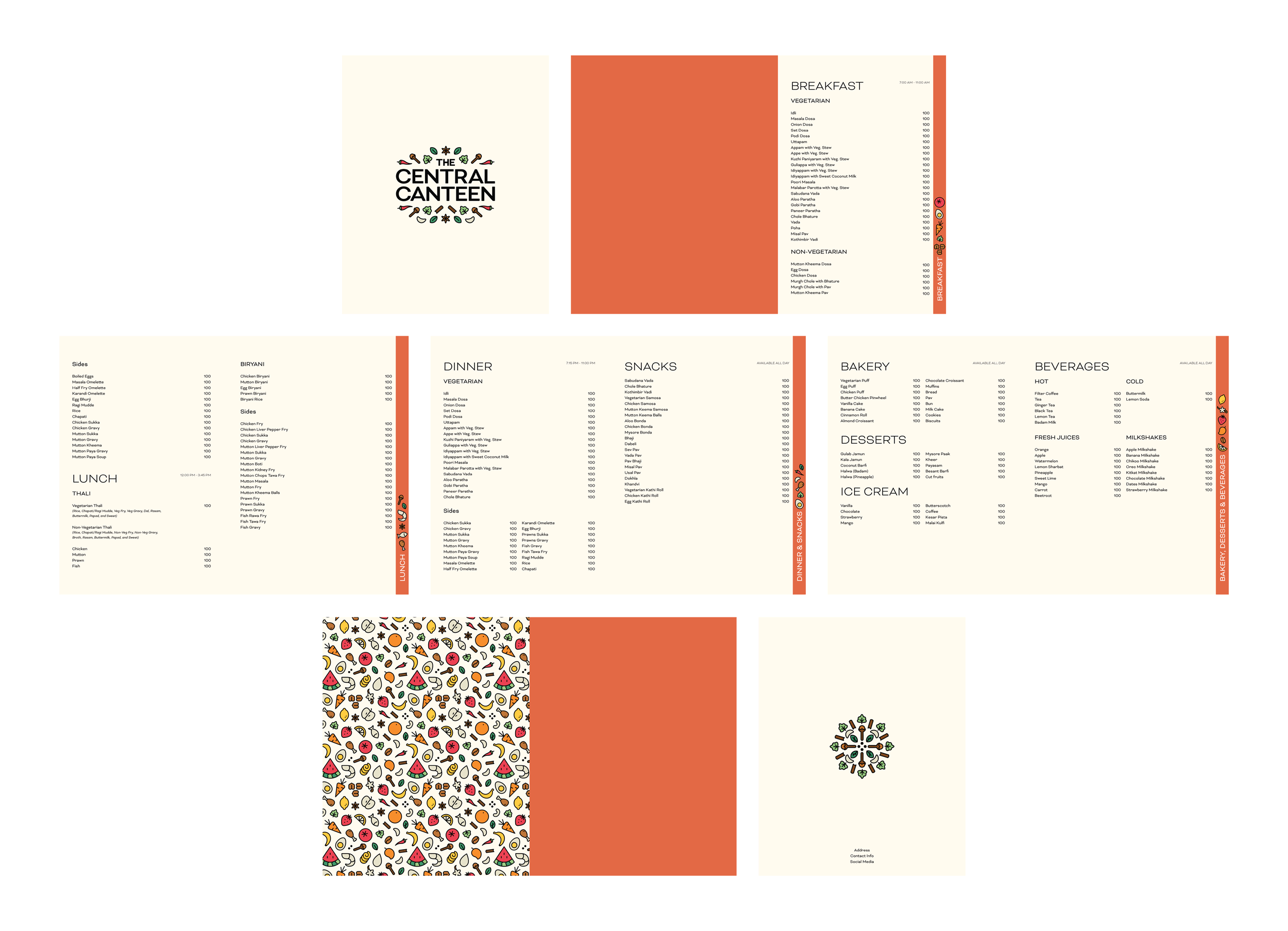
Menu Design -
Illustrations
Brand Patterns
Motifs -
Packaging
Uniforms
Wayfinding
Signage
Brand Patterns
Bags
Concepts and Approach
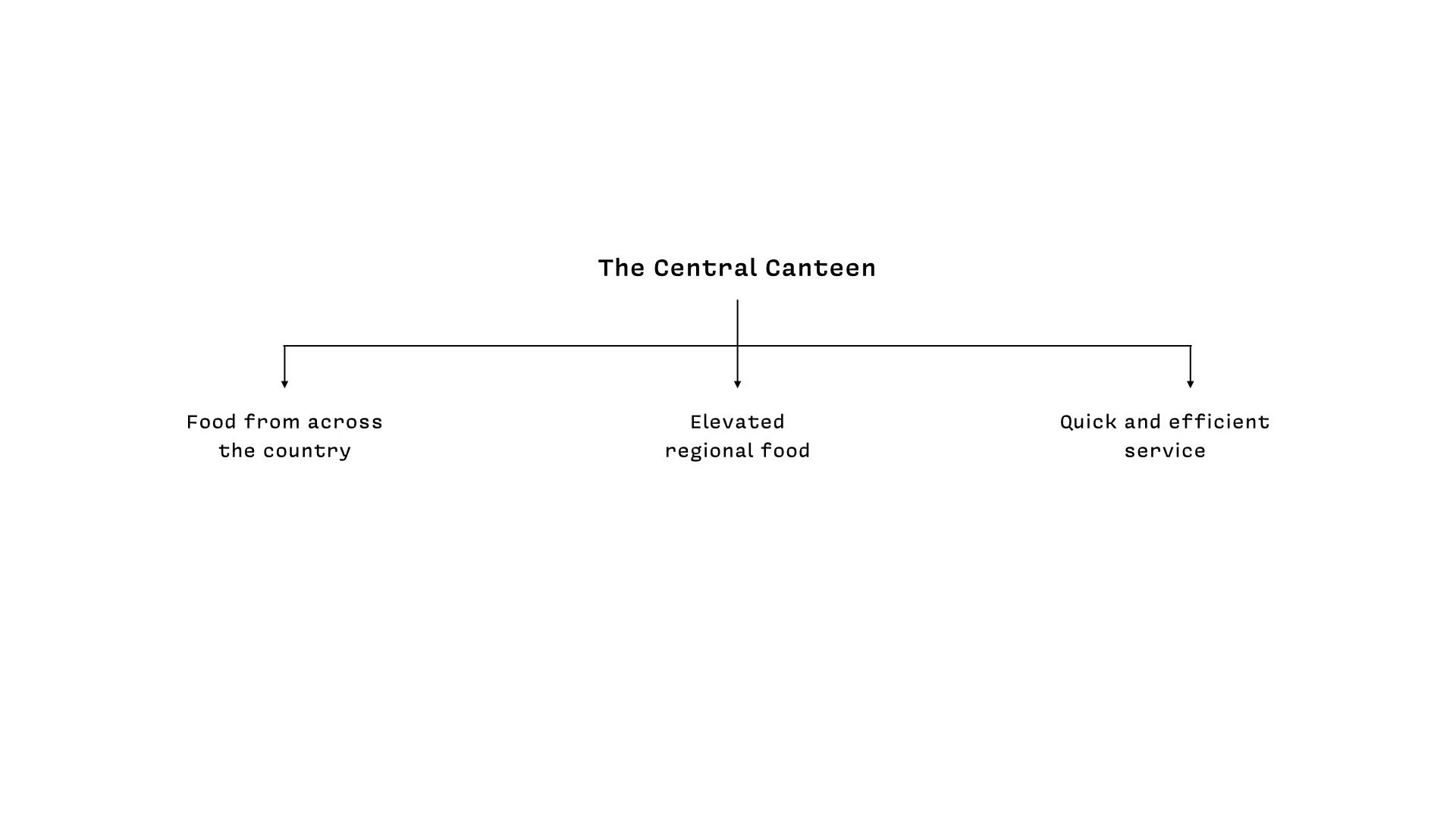
Our approach was to think about ‘The Central Canteen’ from very different aspects, starting with zooming out and holistic consideration.
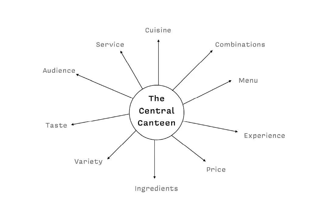
There was a mix of characteristics for us to focus on and elevate:
Quick and efficient service
No frills, no fuss, affordable food
Food from across the country
Elevated regional food
Real food for real people at real prices
Where everyone’s always welcome
Nostalgic, warm, and welcoming
Trustworthy dining experience
We went back with three different concepts…
Route 01The Spice Route
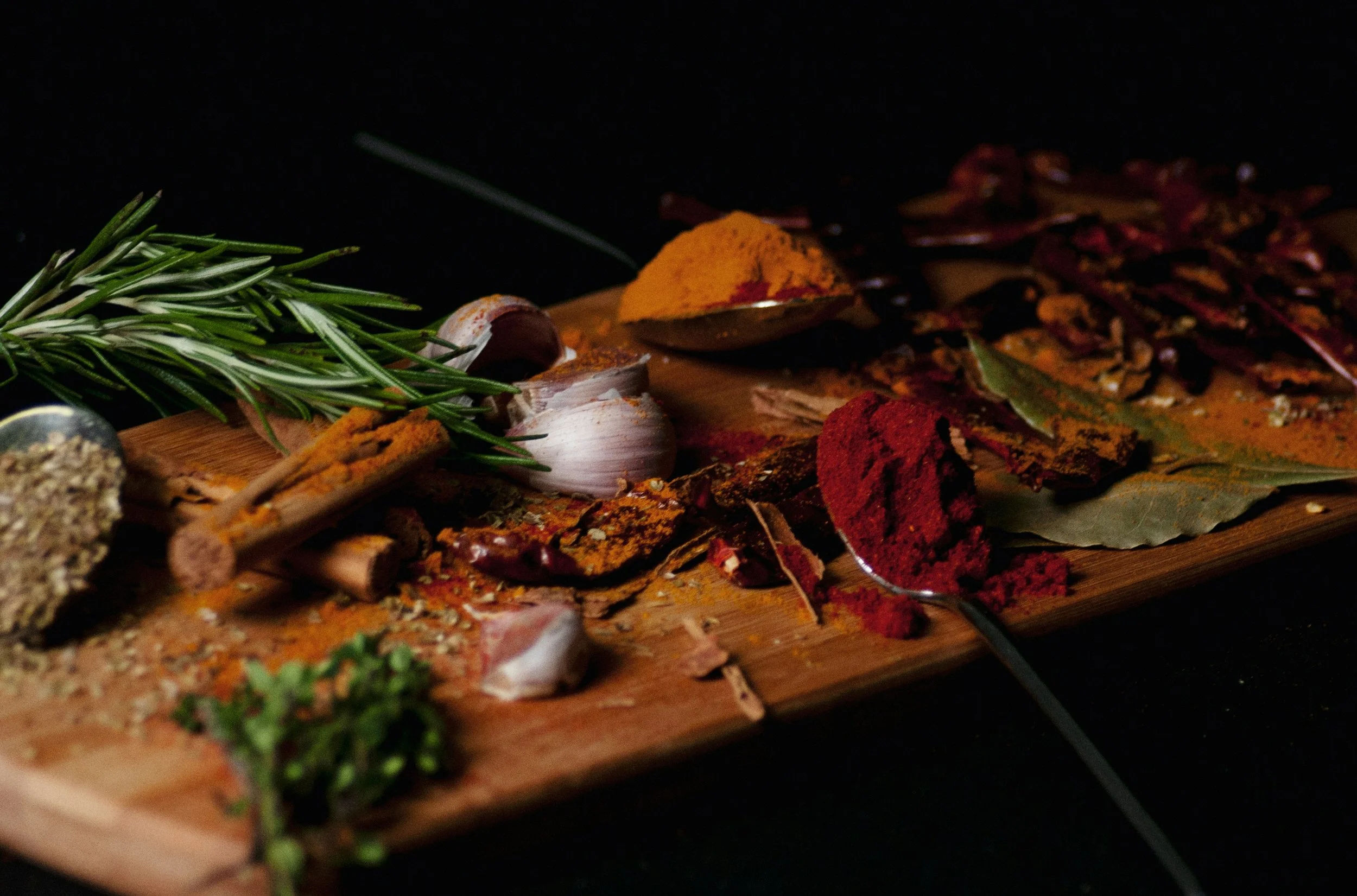
The Indian spices are a common ingredient from across the country. It’s what unites us through our food, and makes us special and known for globally.
ExtensionIn addition to the base spices, we extended the set to address all the flavours and sections of the menu, from the bakery, desserts, juices, to all the mains and sides. This allowed us to create a colourful and playful collection of elements to play with.
FeedbackWhile this execution was bright and lively in the authentic Indian food space, it felt similar to other cuisines. It felt familiar, but not unique.
Route 02The Meeting Point
The Central Canteen is the intersection and meeting point of various possibilities. It’s where Regional meets Elevated, where North meets South, Pan-Indian meets Local – all in a single meal, on a single plate.
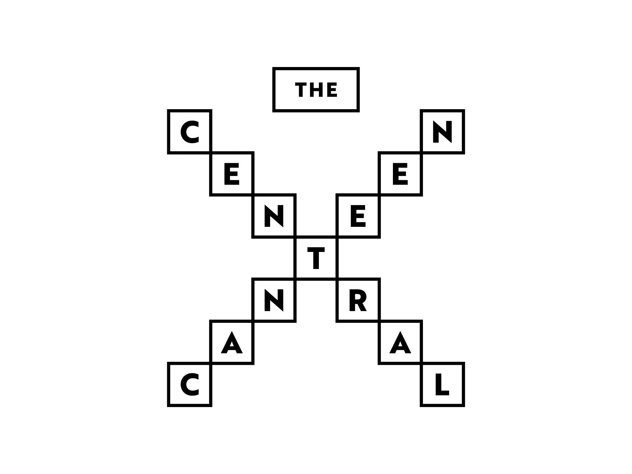
ExtensionThe aesthetic that stemmed from this was visually striking and easily recognisable on a busy store front. Paired with beautiful food photography, the tiled typography gave room to an unforgettable and graphic identity system.
FeedbackThis route was unlike anything they had ever seen in the food space; it was bolder and targeted a younger audience. However, while it was modern it lacked the warmth they were looking for.
Route 03Always more than one
Indian food is always eaten in plural, never alone. The Central Canteen specialises in variety on every plate, where every main is adorned with sides.
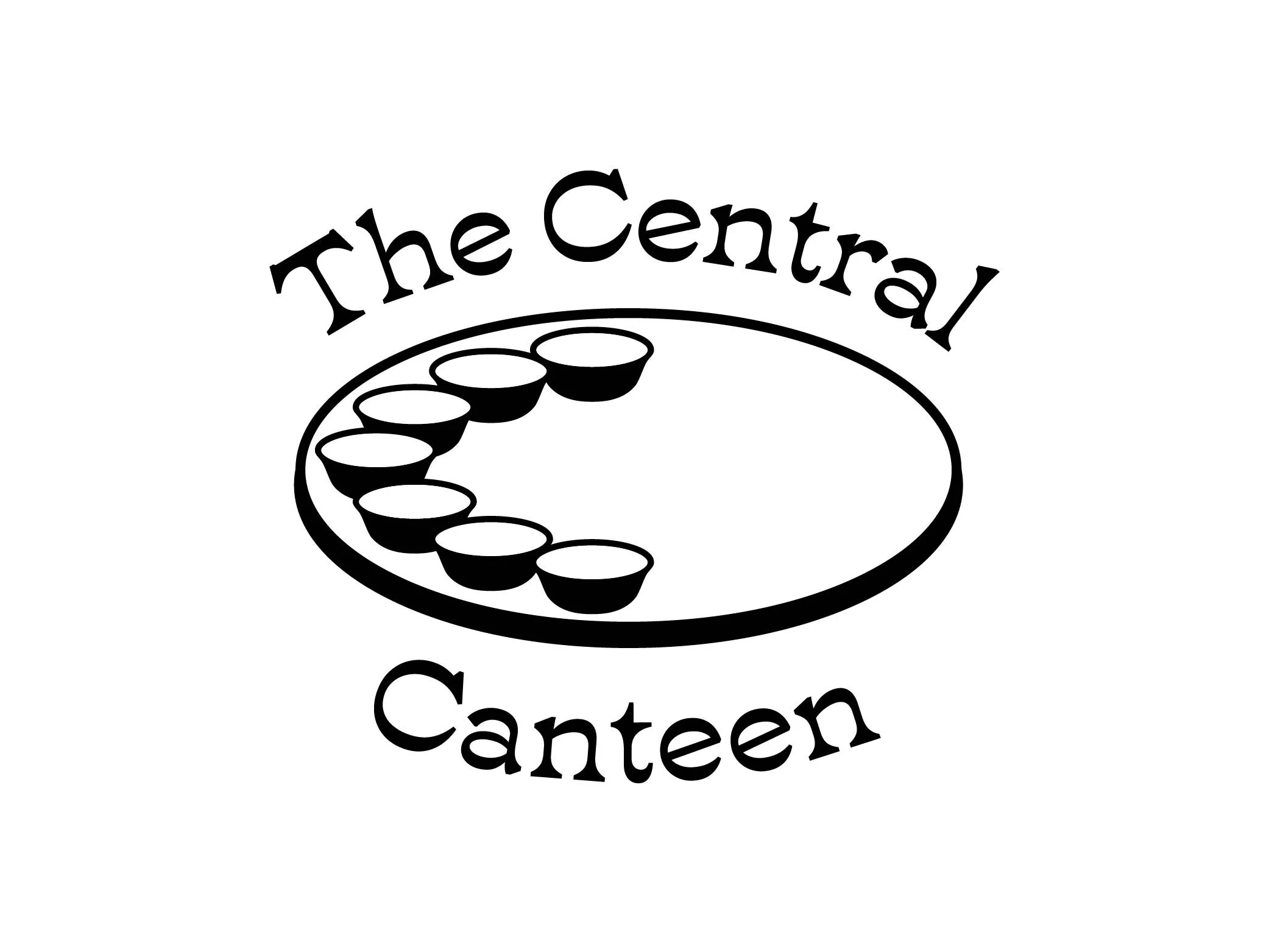
ExtensionThe design approach for this route was a more direct take on Indian restaurants, with warm colours and consistent brand design. It referenced traditional Indian restaurants from the 90s, with an elevated aesthetic.
FeedbackThe ‘katori’, or small bowl for the sides had never been made the hero; and this was highly appreciated. They loved the direct and nostalgic approach, but it wasn’t modern.
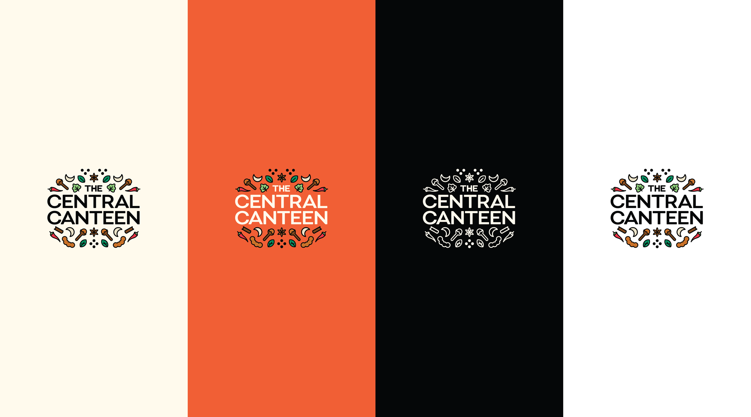
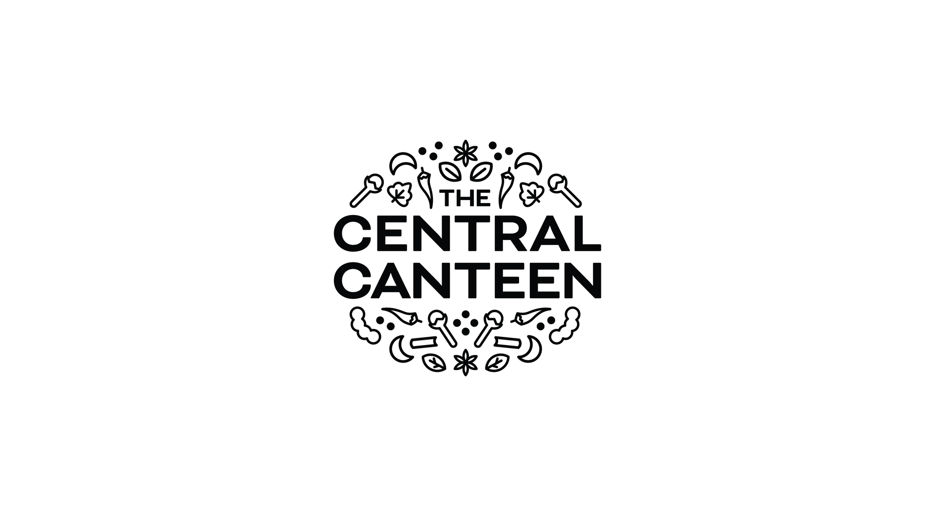


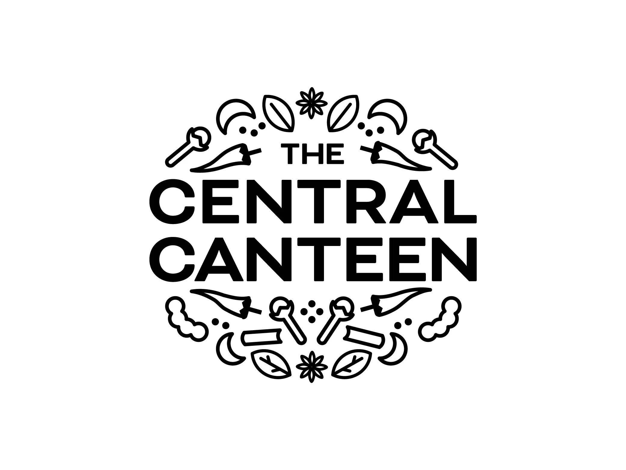
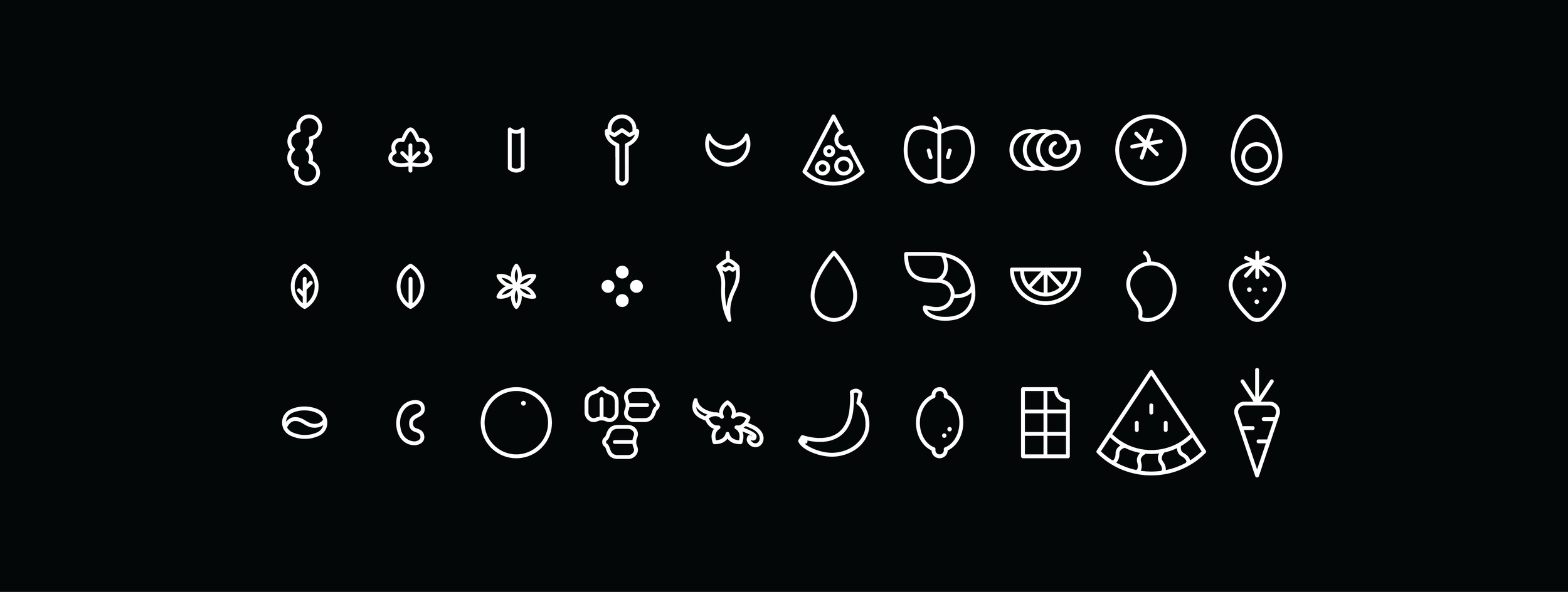
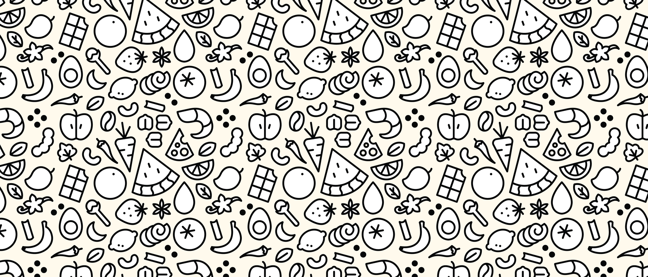
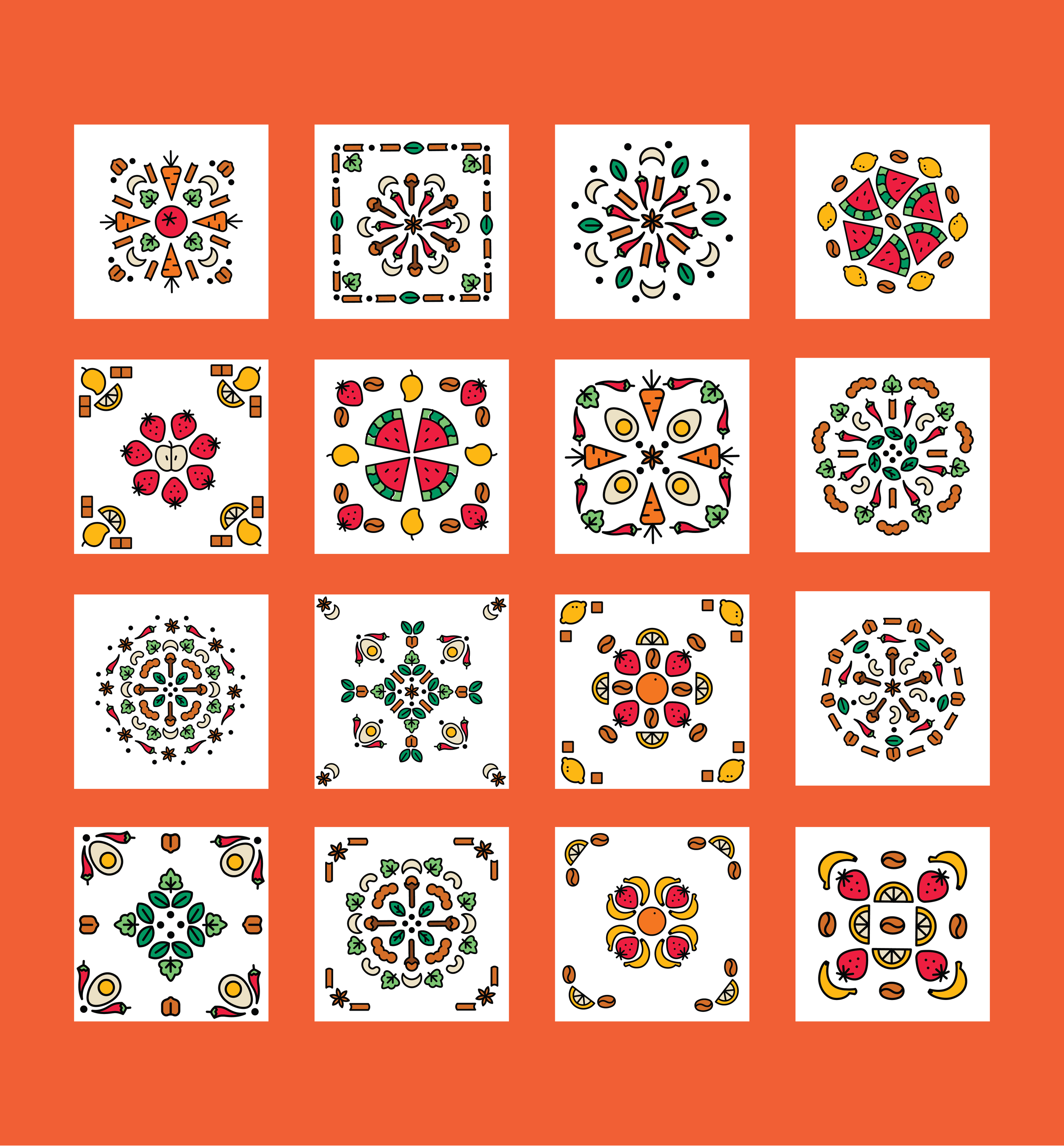
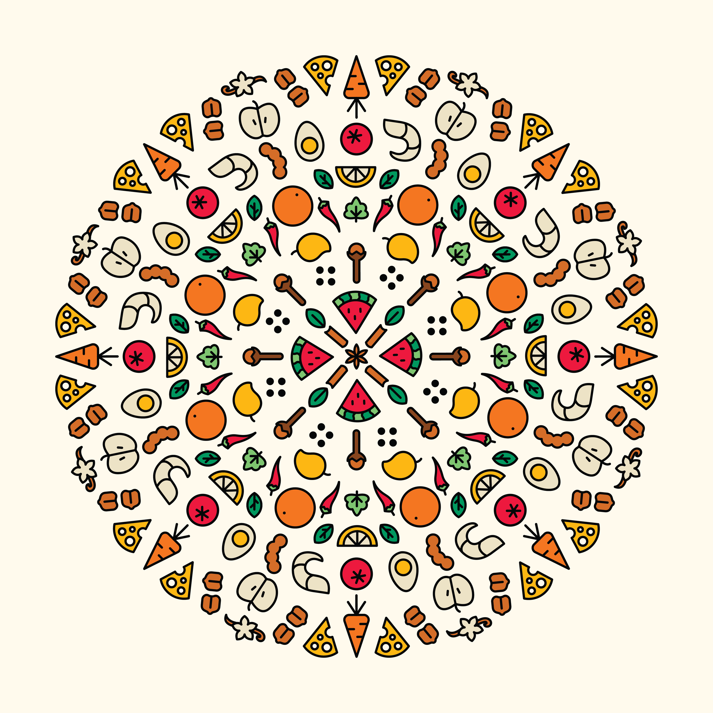
We built a custom set of iconography inspired by the spices and ingredients used for all the sections of the menu. These 30 icons were then used to create patterns, textures, motifs, backgrounds, and wraps for small and big applications across the space.


Environmental Design Concepts
Looking through the list of features that made The Central Canteen special, there were three in particular that stood out. These were also important points of the restaurant that the founders wanted highlighted, and gave us a base to build on and illustrate.
We worked on the concept sketches for three routes, of which the 3rd route was approved.
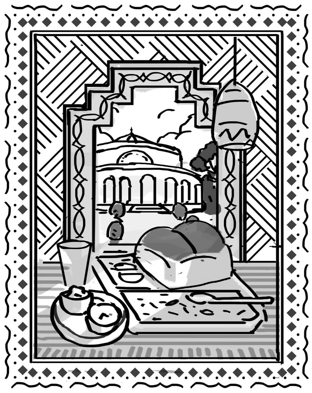
Route 01Pan-Indian Food
Food from across the country, right here in Bangalore.
Visualised aside a calming window view, with the feeling of escaping the busy hustle.
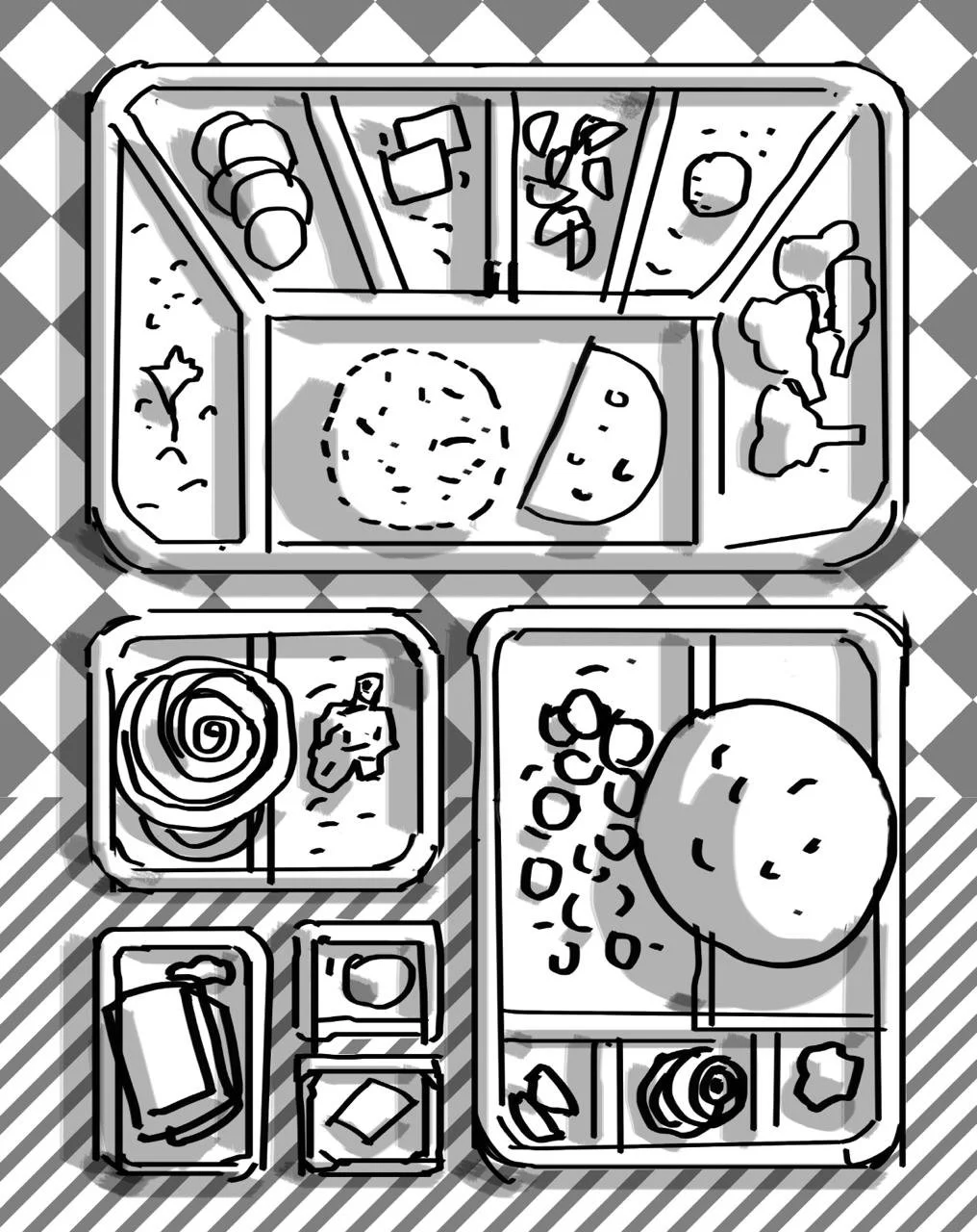
Route 02Elevated Regional Food
Traditional food portrayed in an unexpected style
Highlighting the variety and diverse combinations possible
Route 03Quick & Efficient Service
The energy, vibrance and dynamism of a QSR experience
The behind the scenes creation process of the food
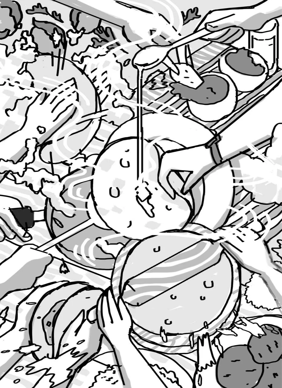
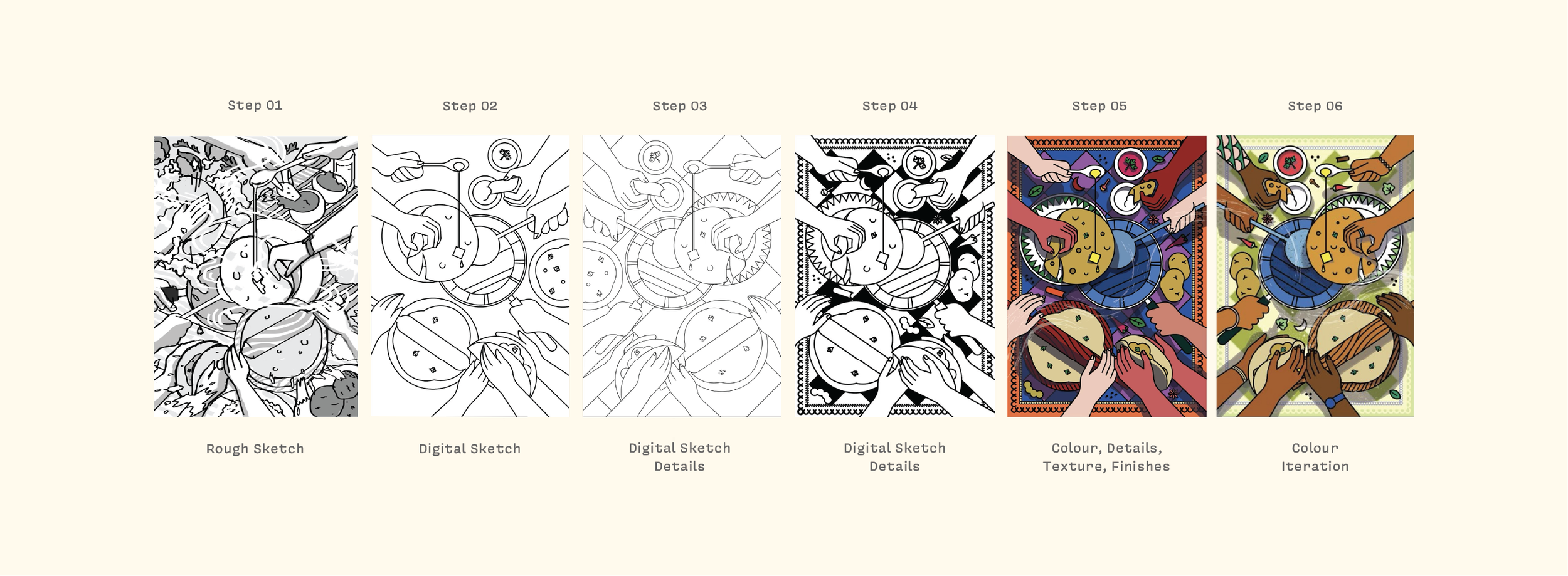
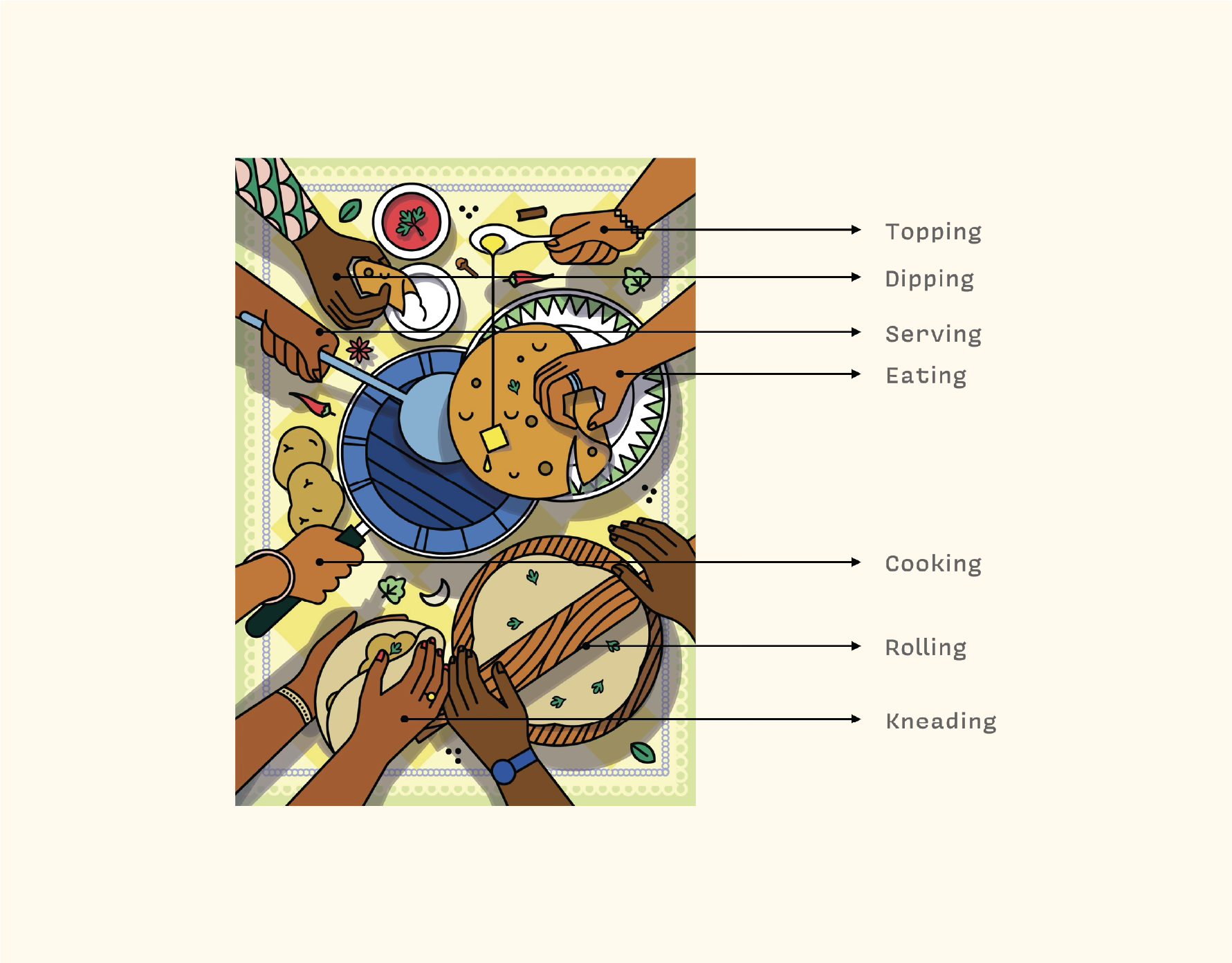
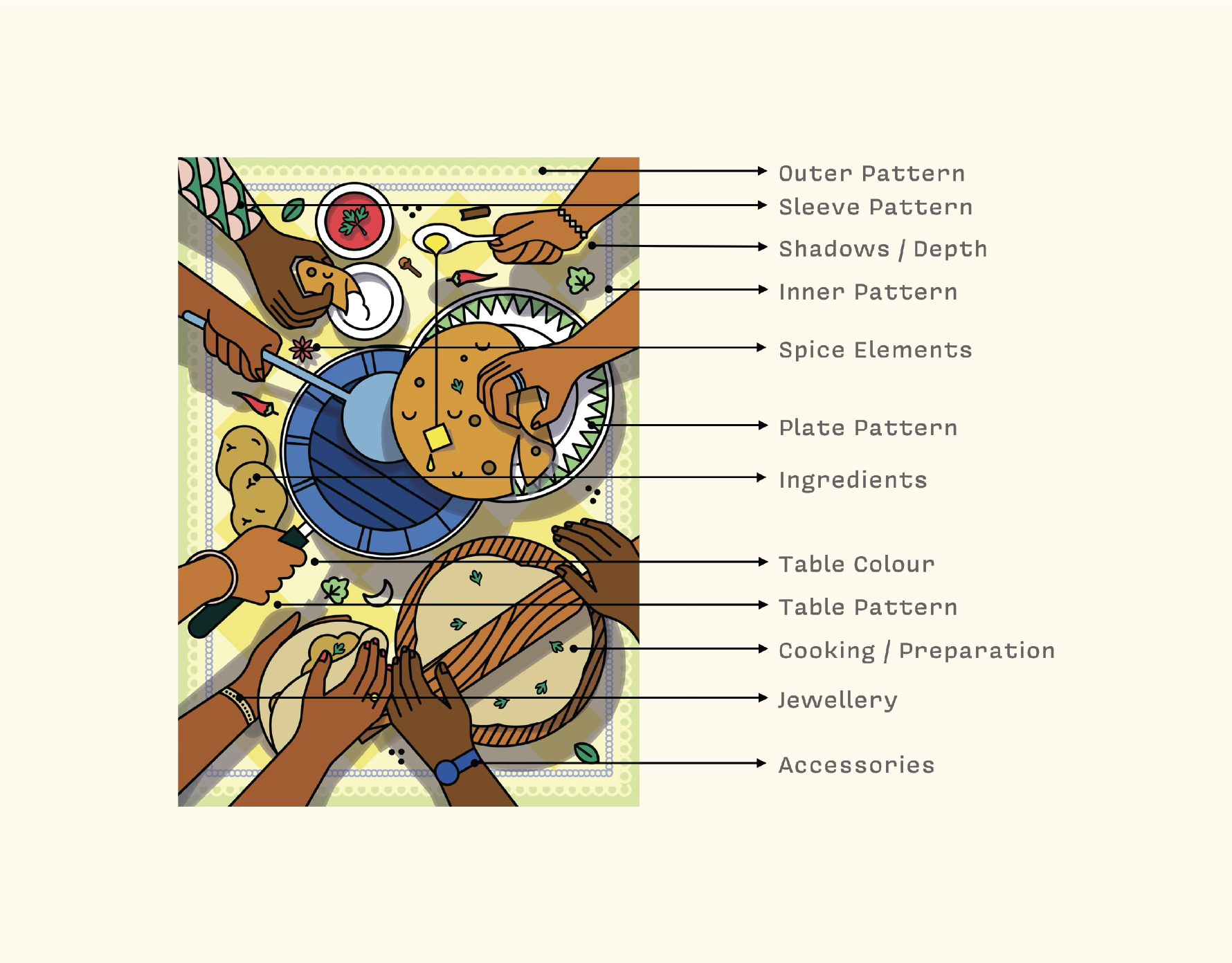
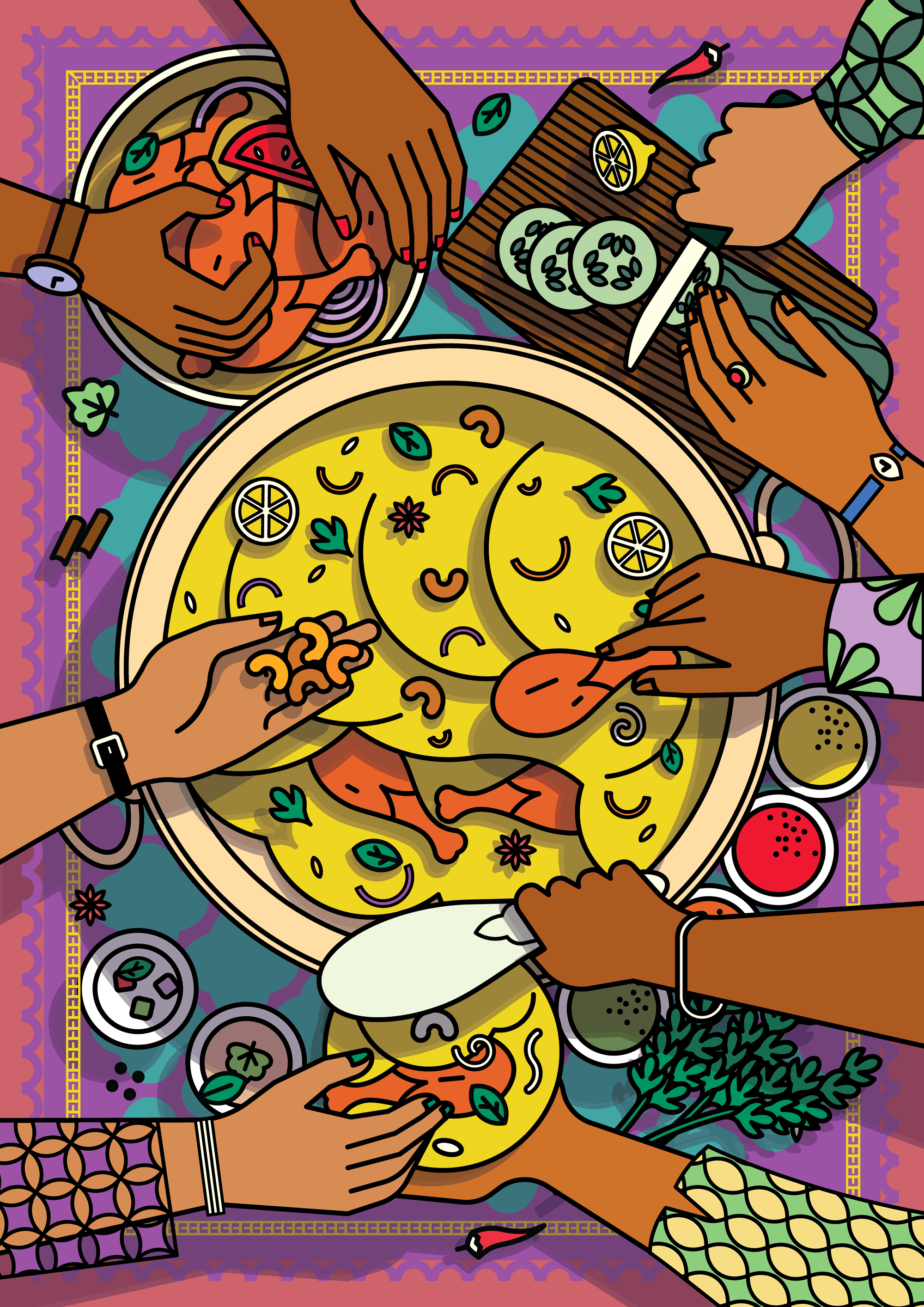
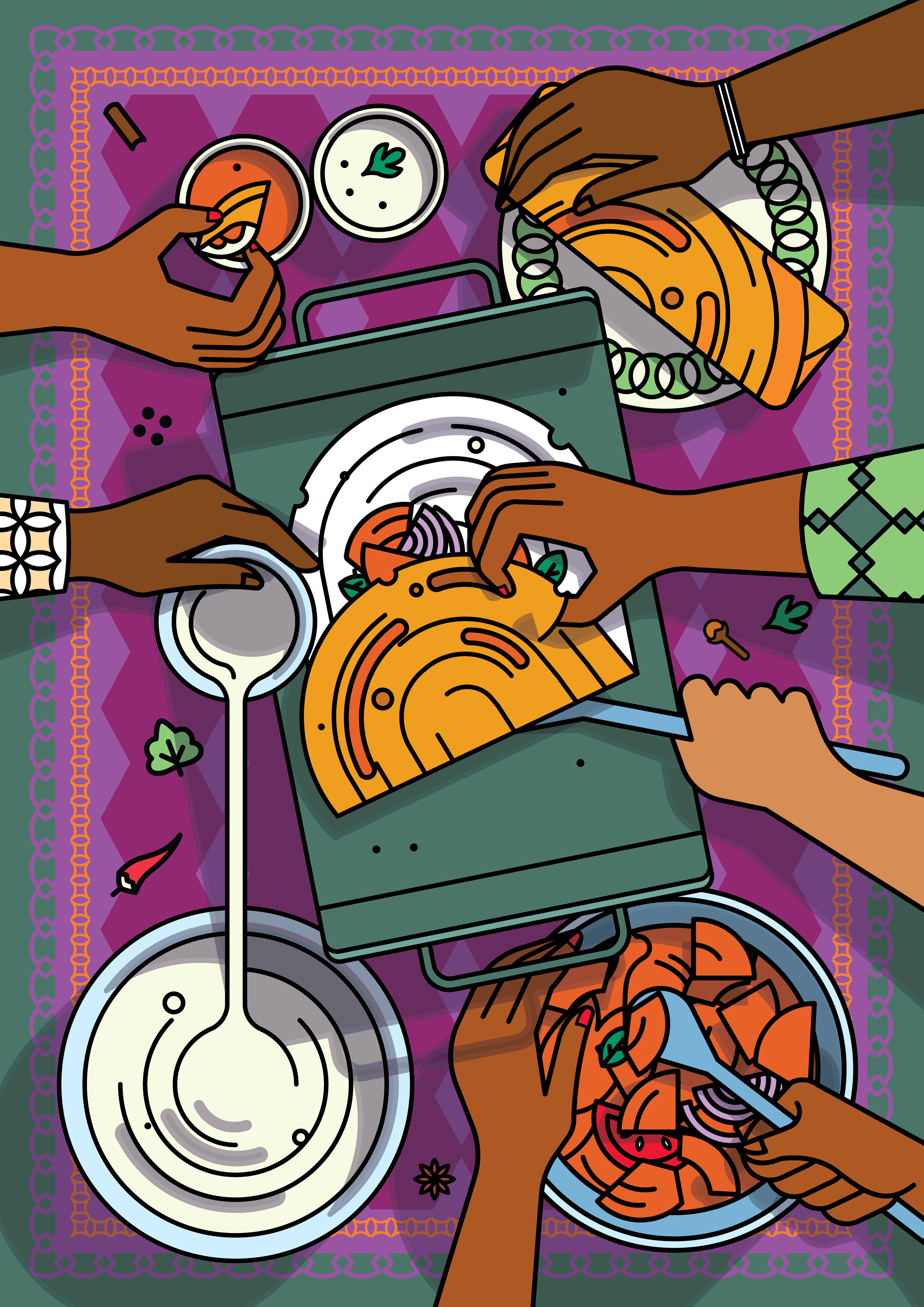
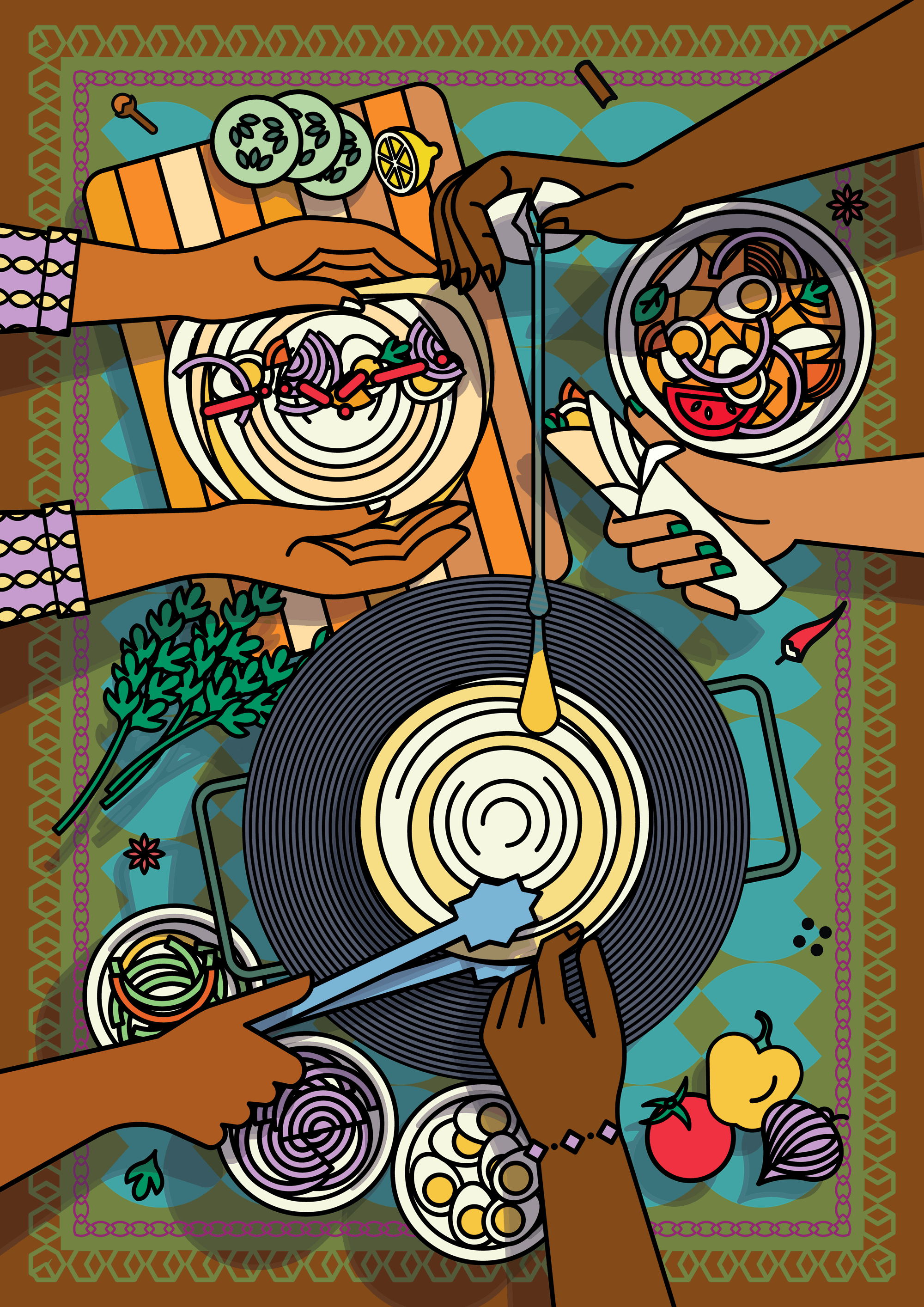
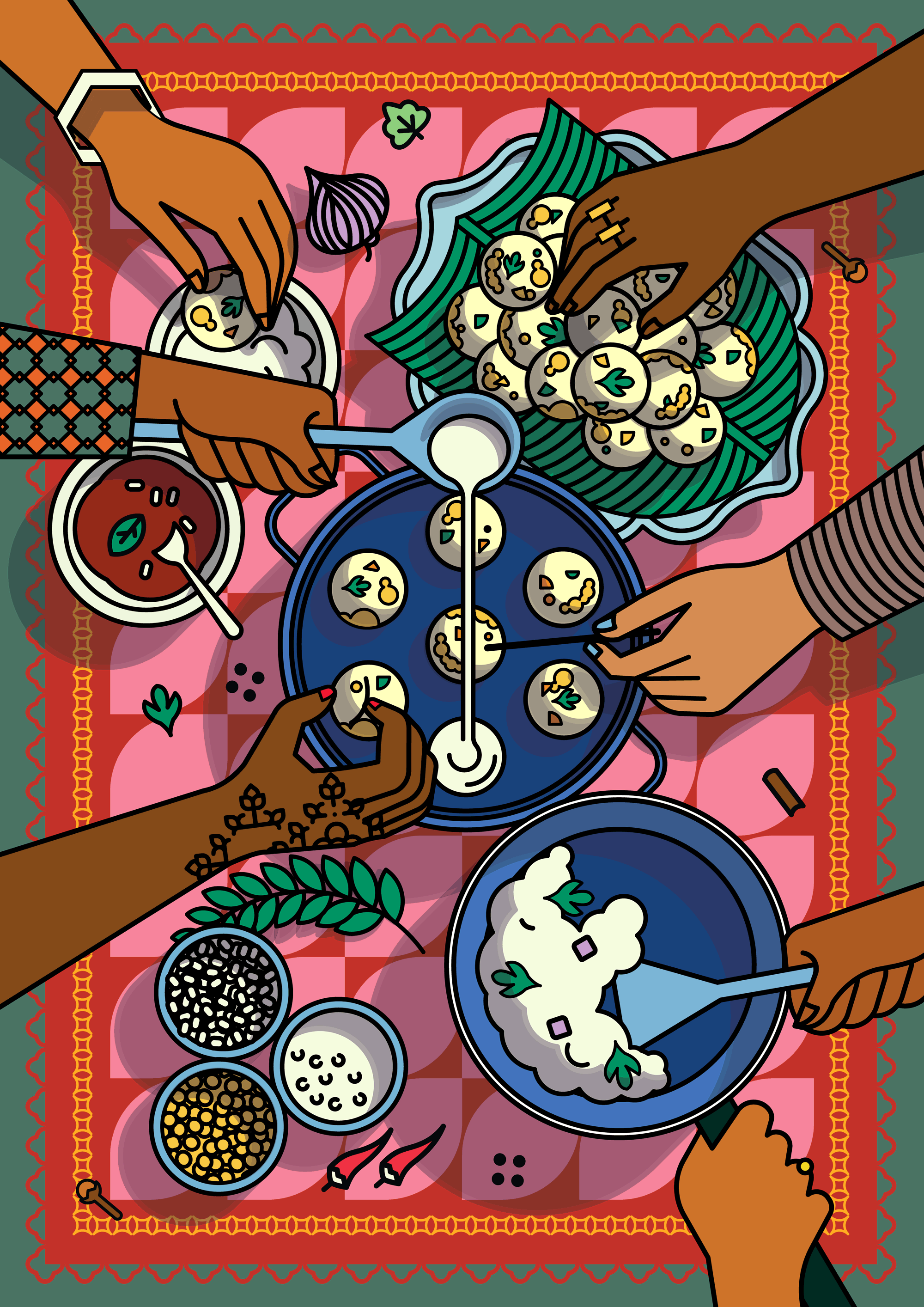
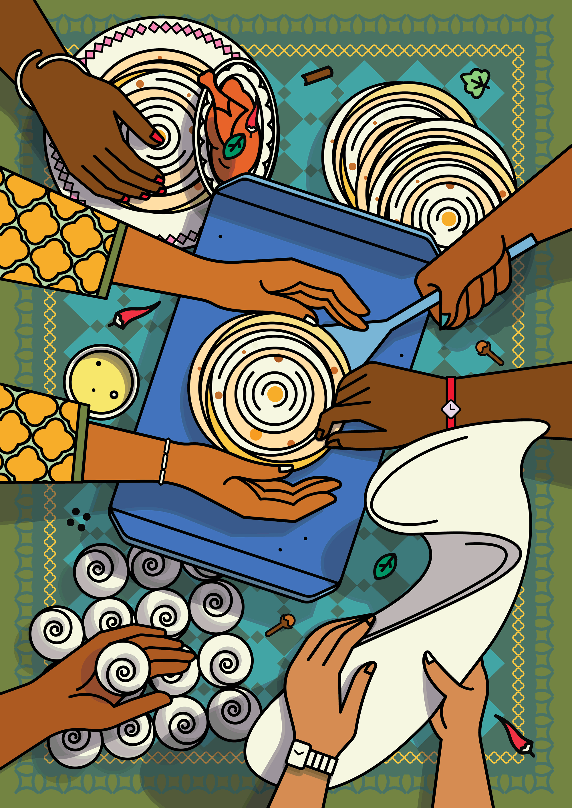
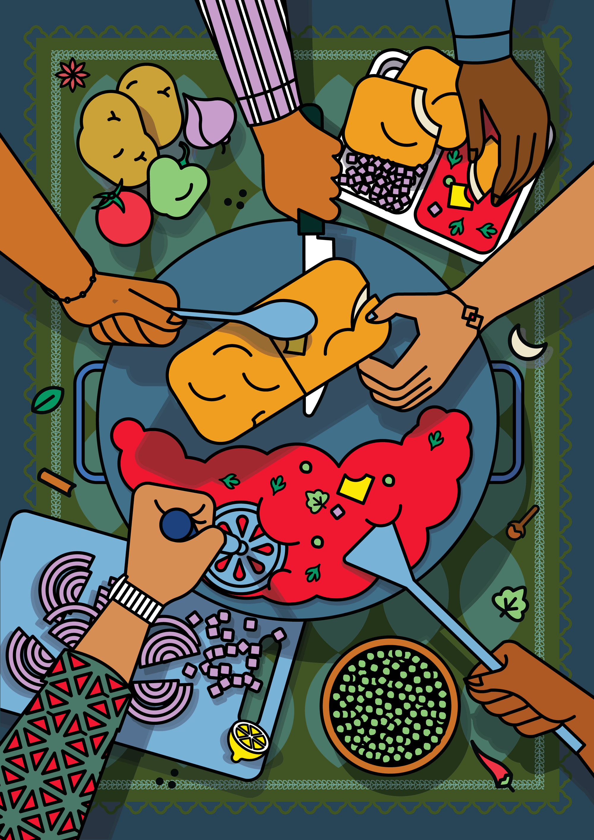
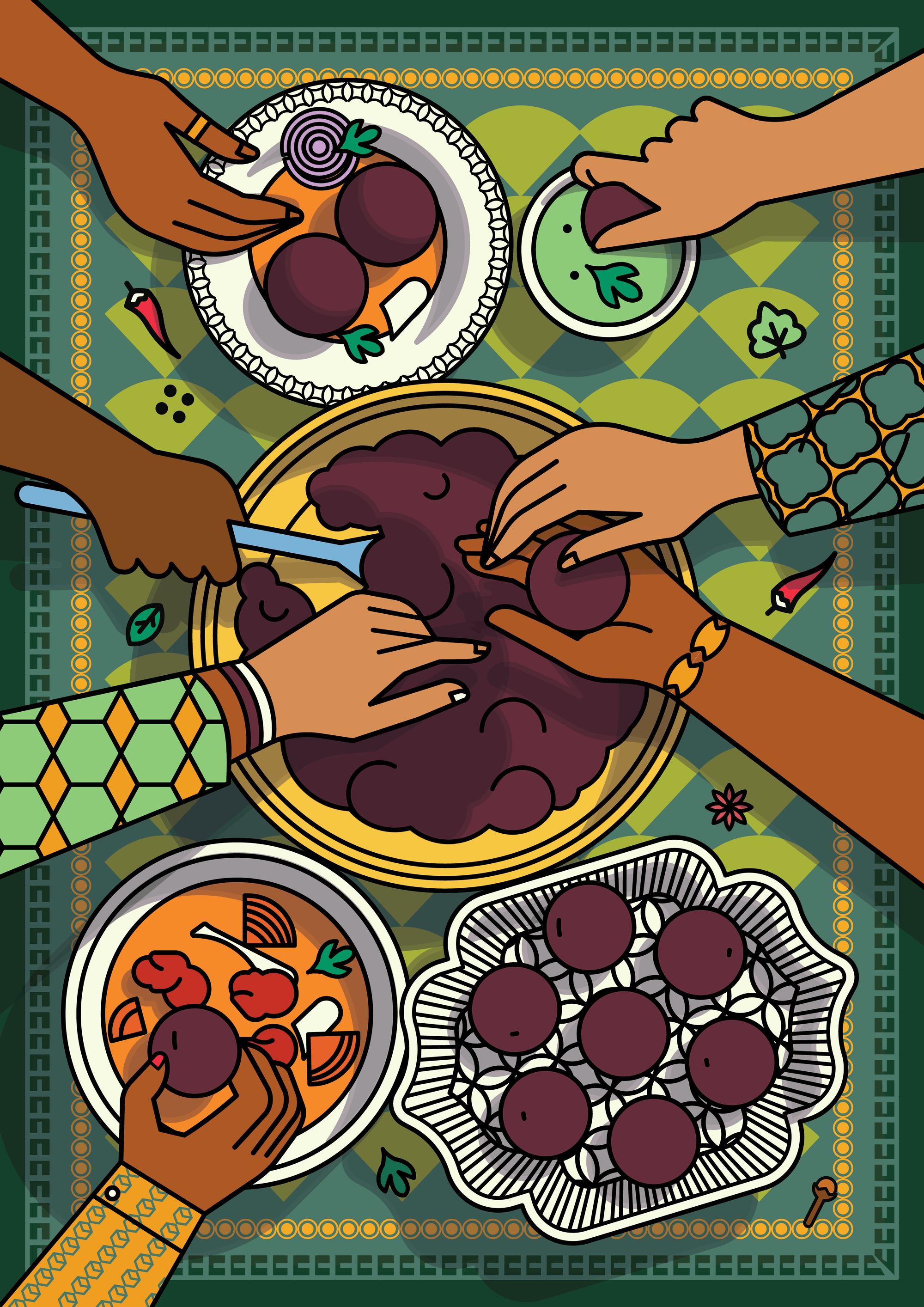
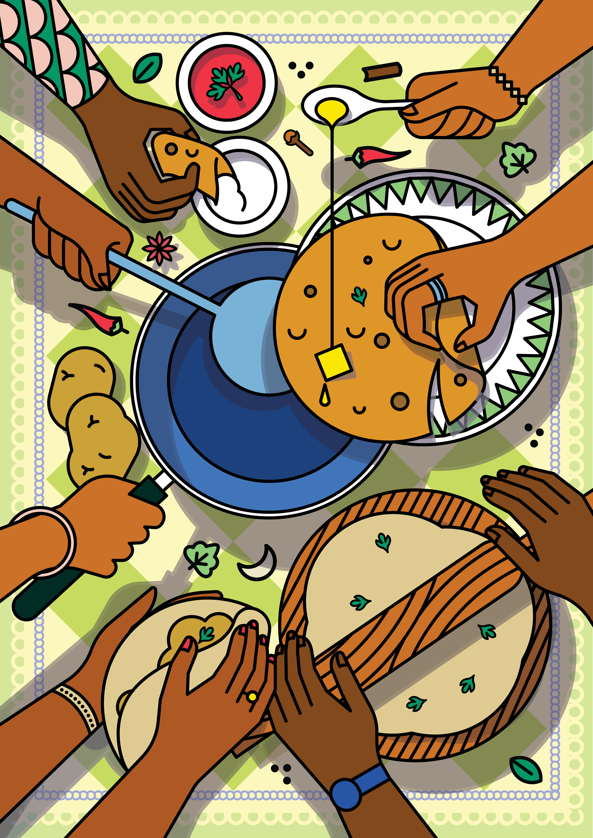
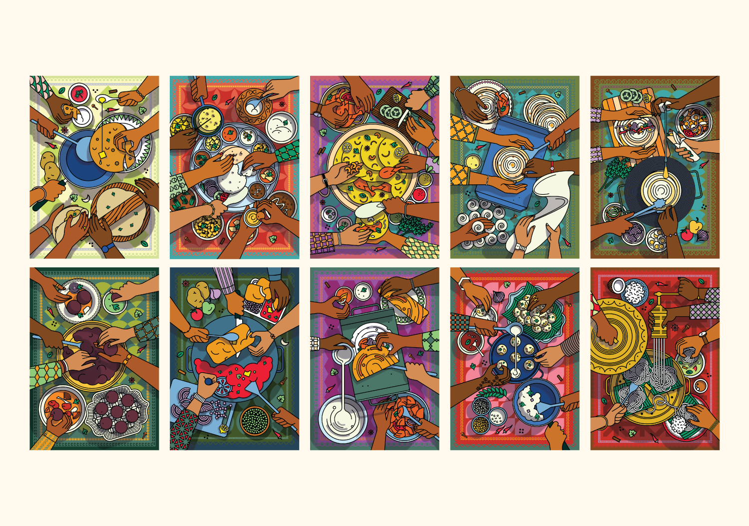
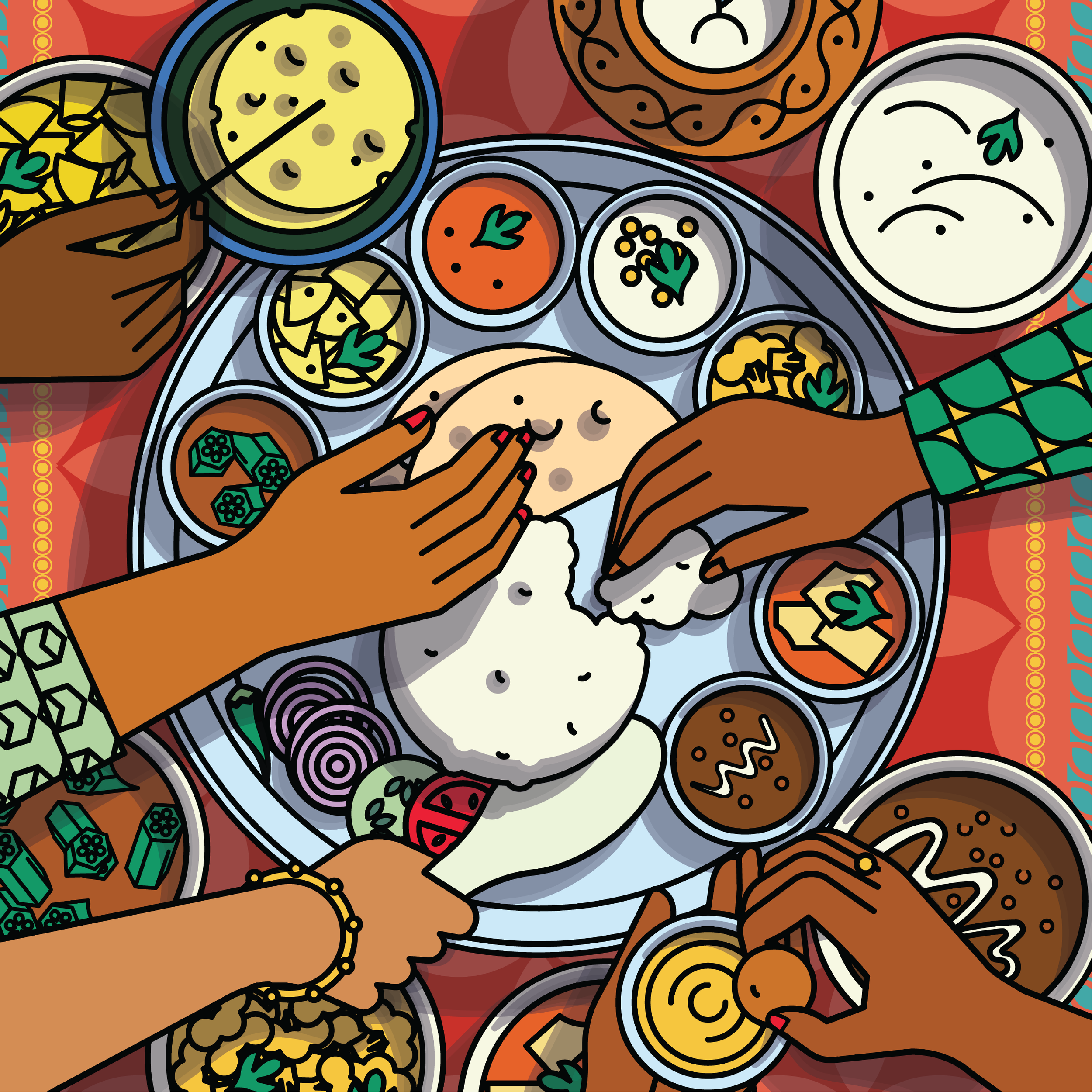
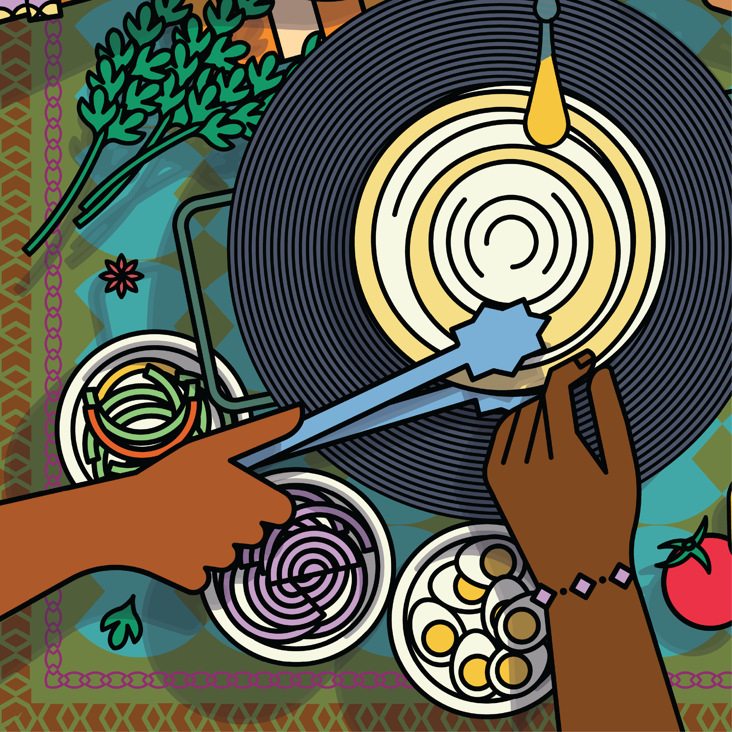
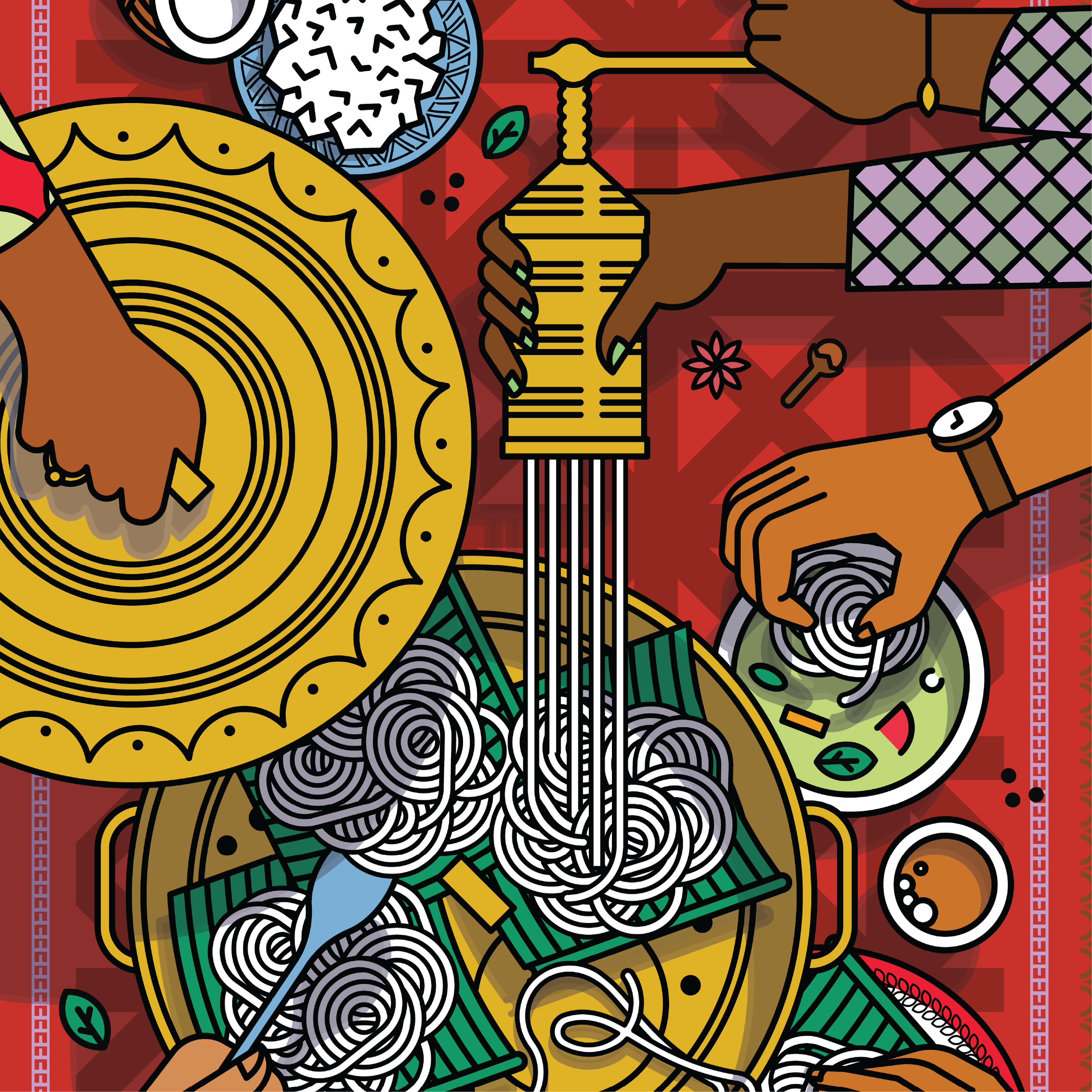
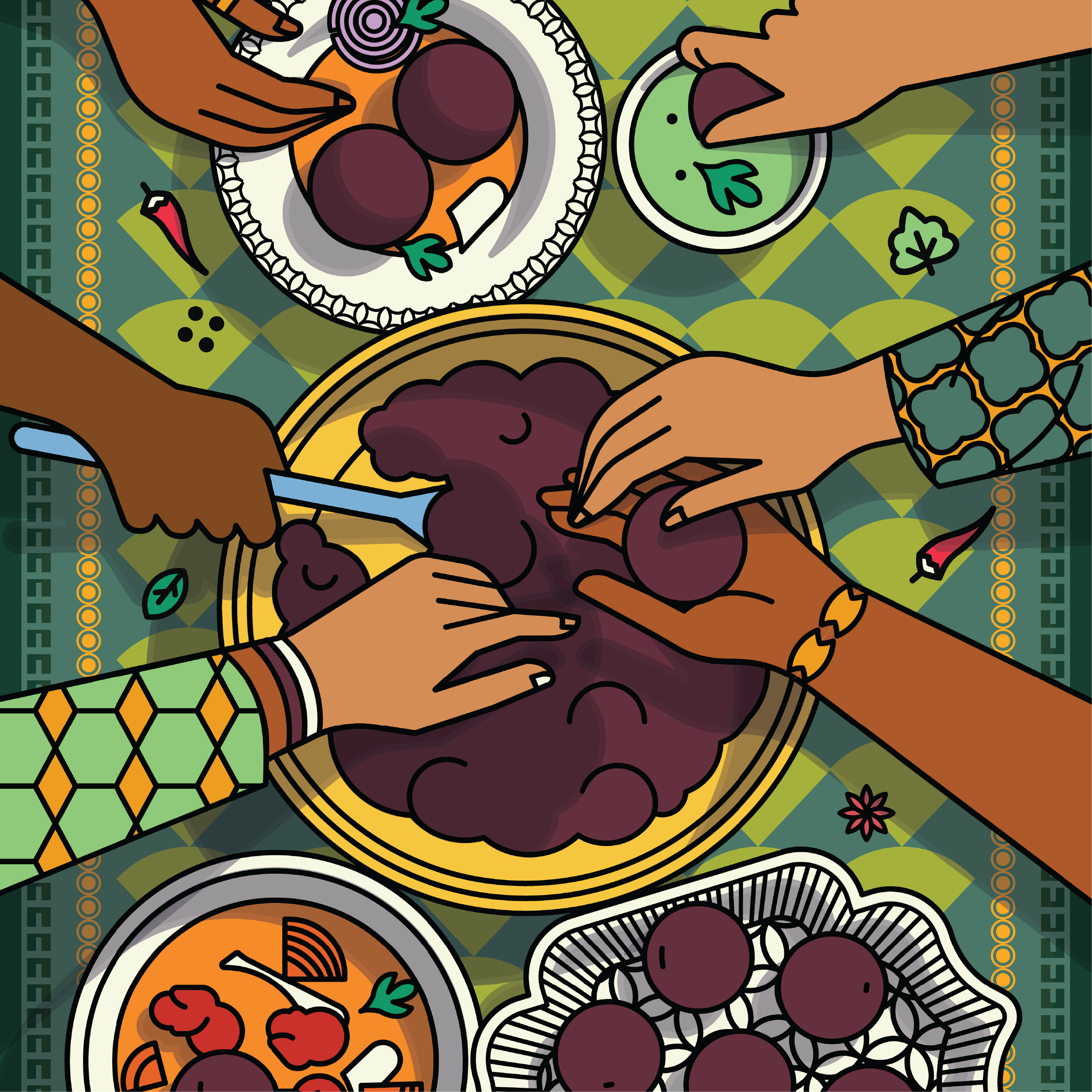
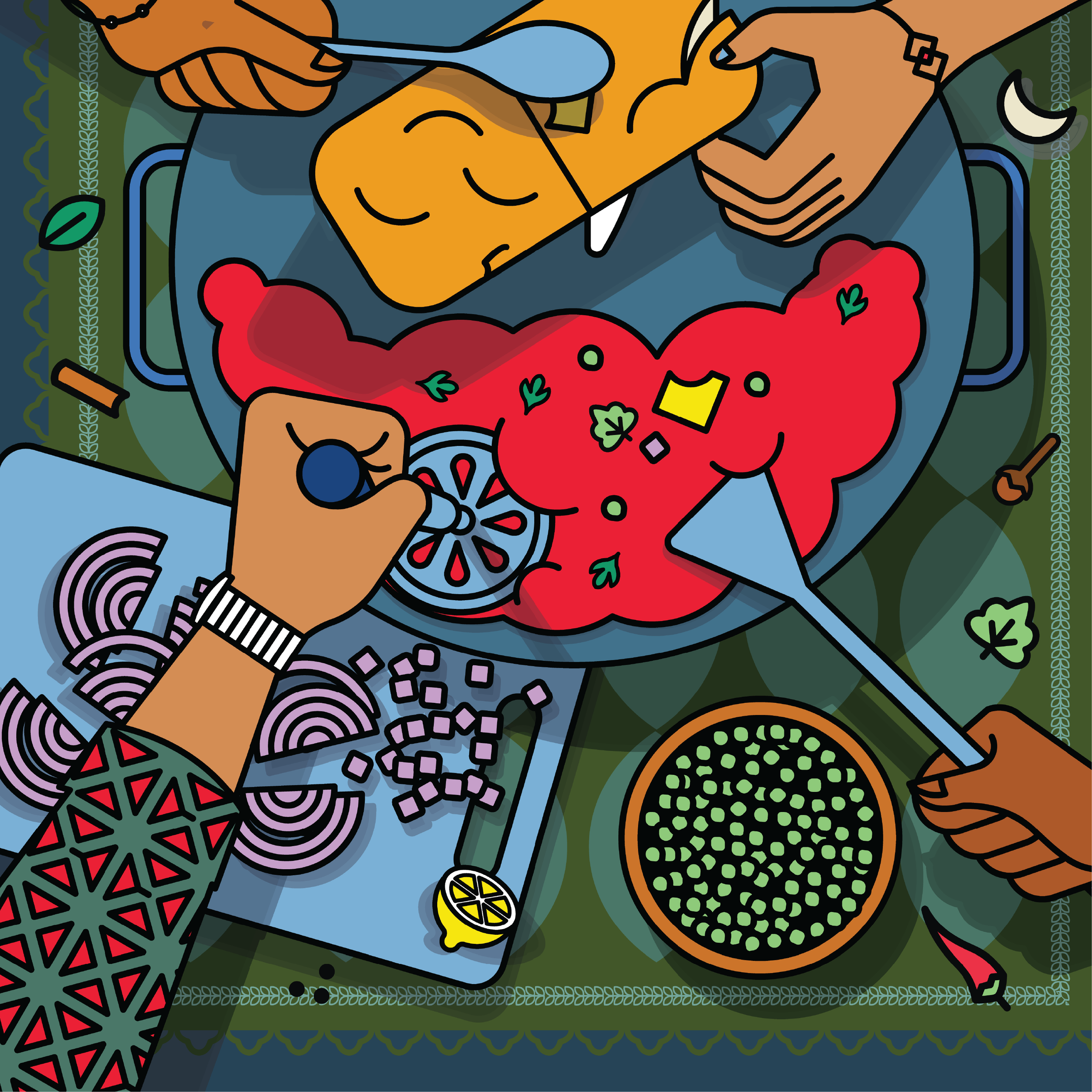
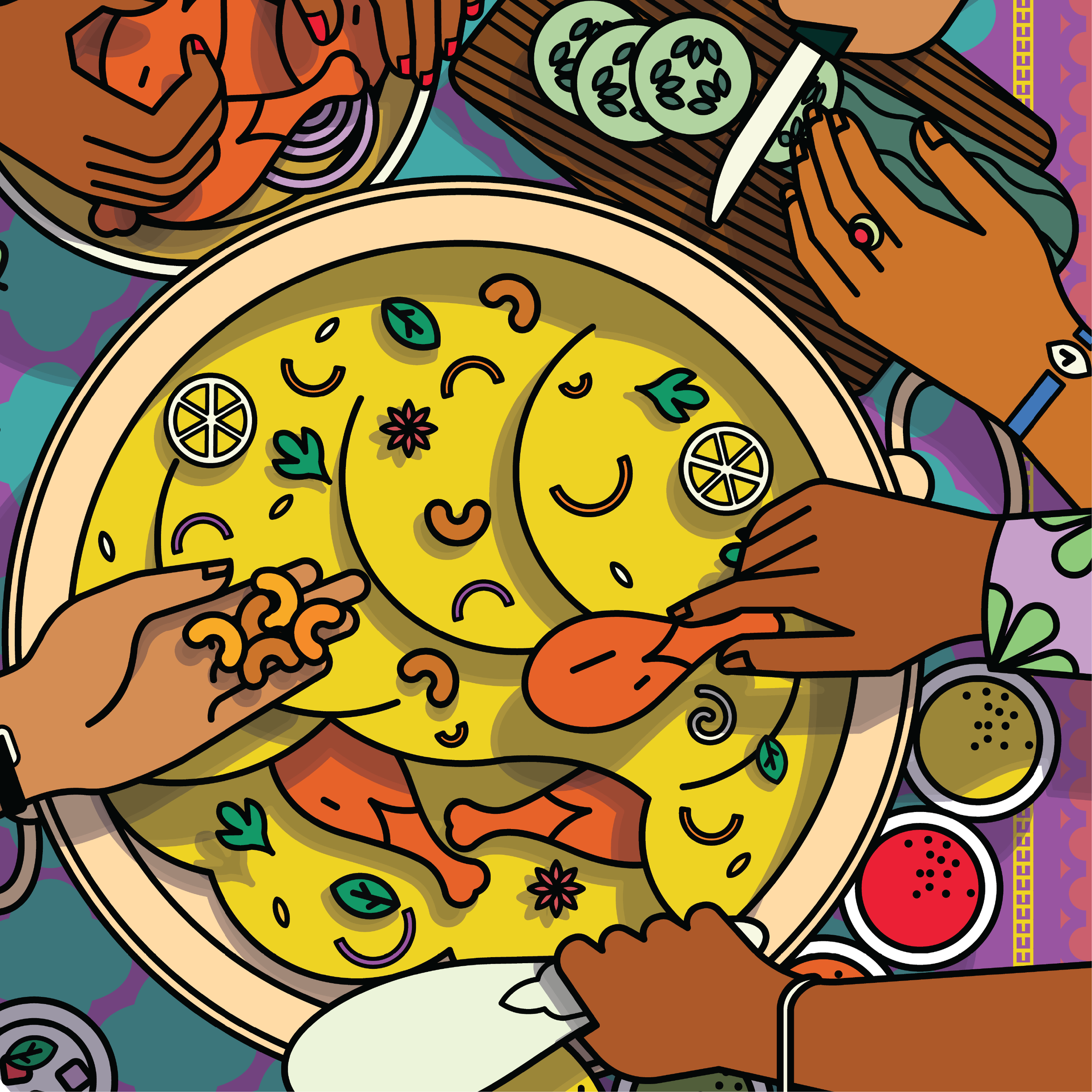
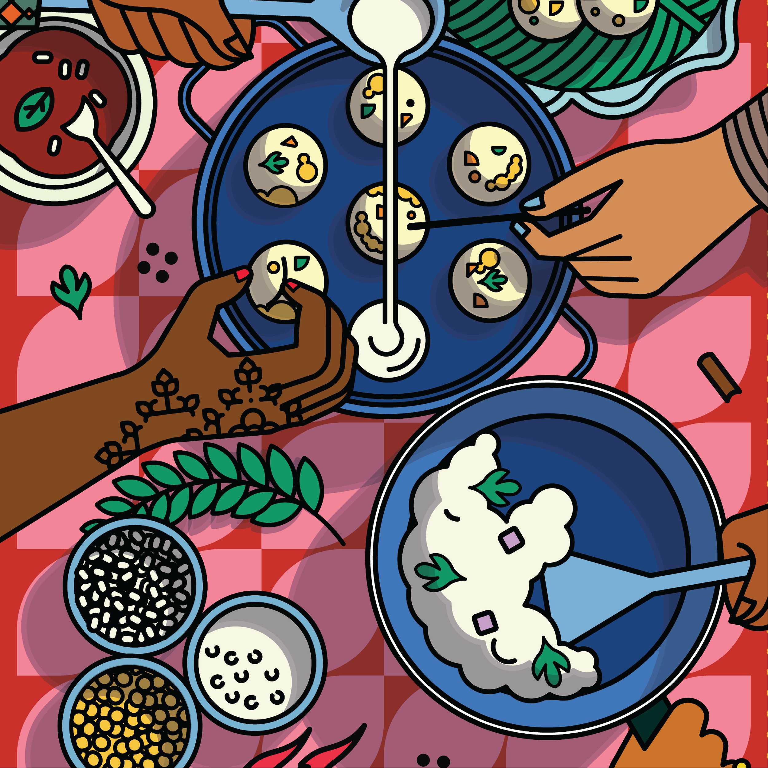
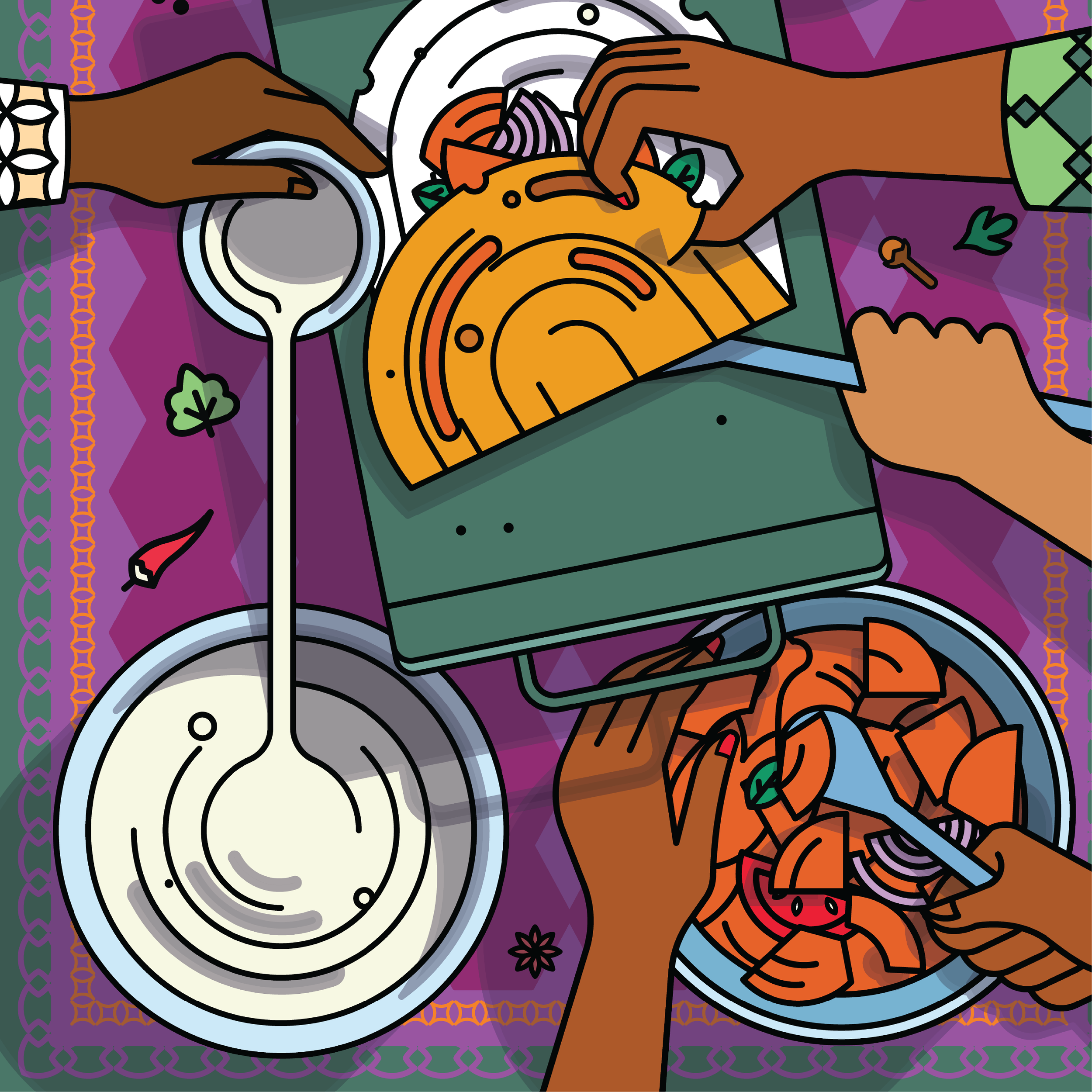
A set of illustrated posters was illustrated of the significant dishes from the menu based on popularity, regionality, and preparations.
The concept for the environmental design was ‘A Day in the Life of…’.
We took singular dishes and covered the lifespan of that dish from cooking to eating. Depicting the very hands-on involvement of every step, which is typical of Indian cuisine.
We gave it a sense of speed and urgency to resonate with the quick-service nature of The Central Canteen. In essence, it felt like the food was being eaten as it was being cooked and served.
Chicken Biriyani
Chicken Dosa
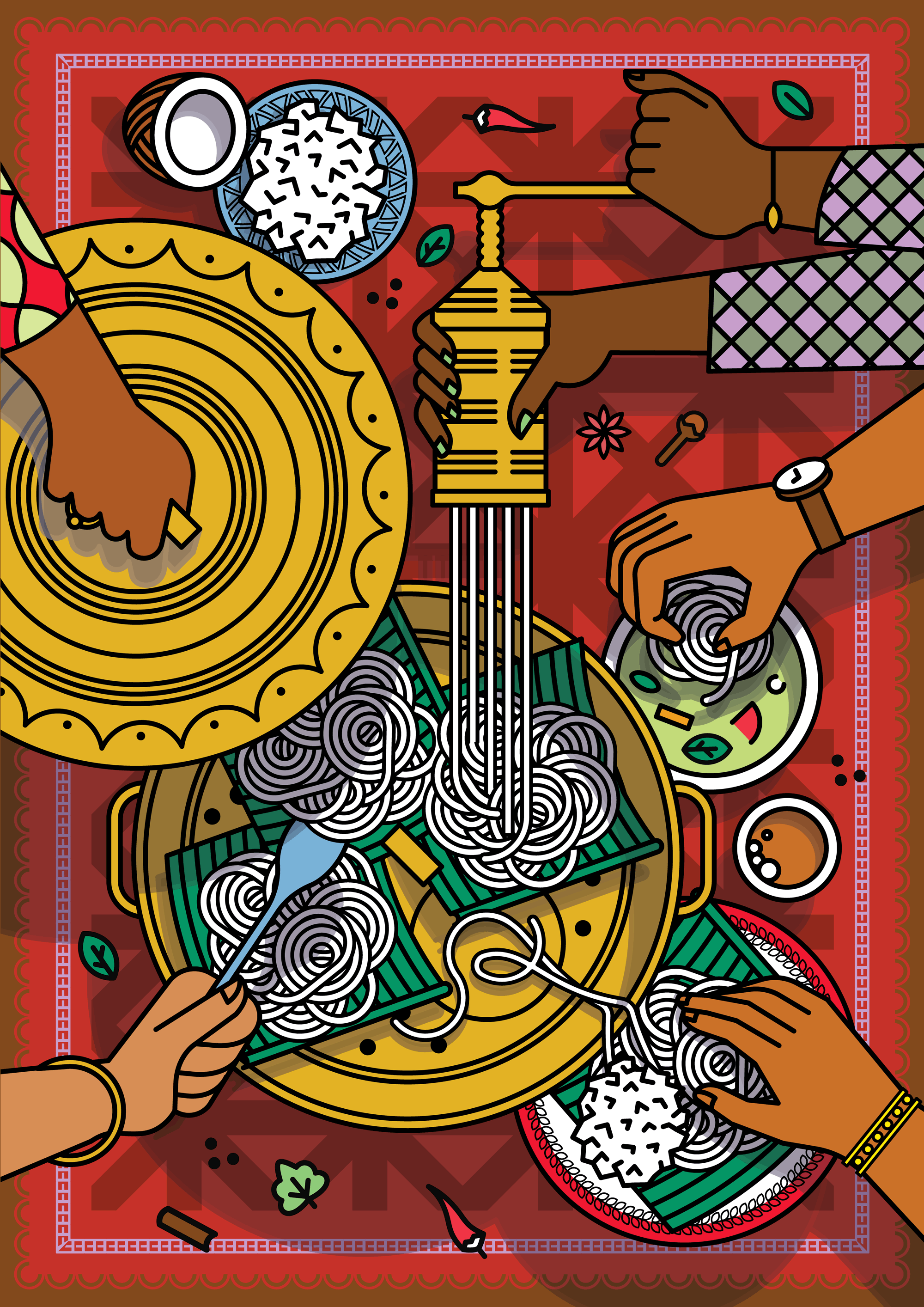
Idiyappam
Kathi Roll
Kuzhi Paniyaram
Malabar Parota
Pav Bhaji
Raagi Mudde
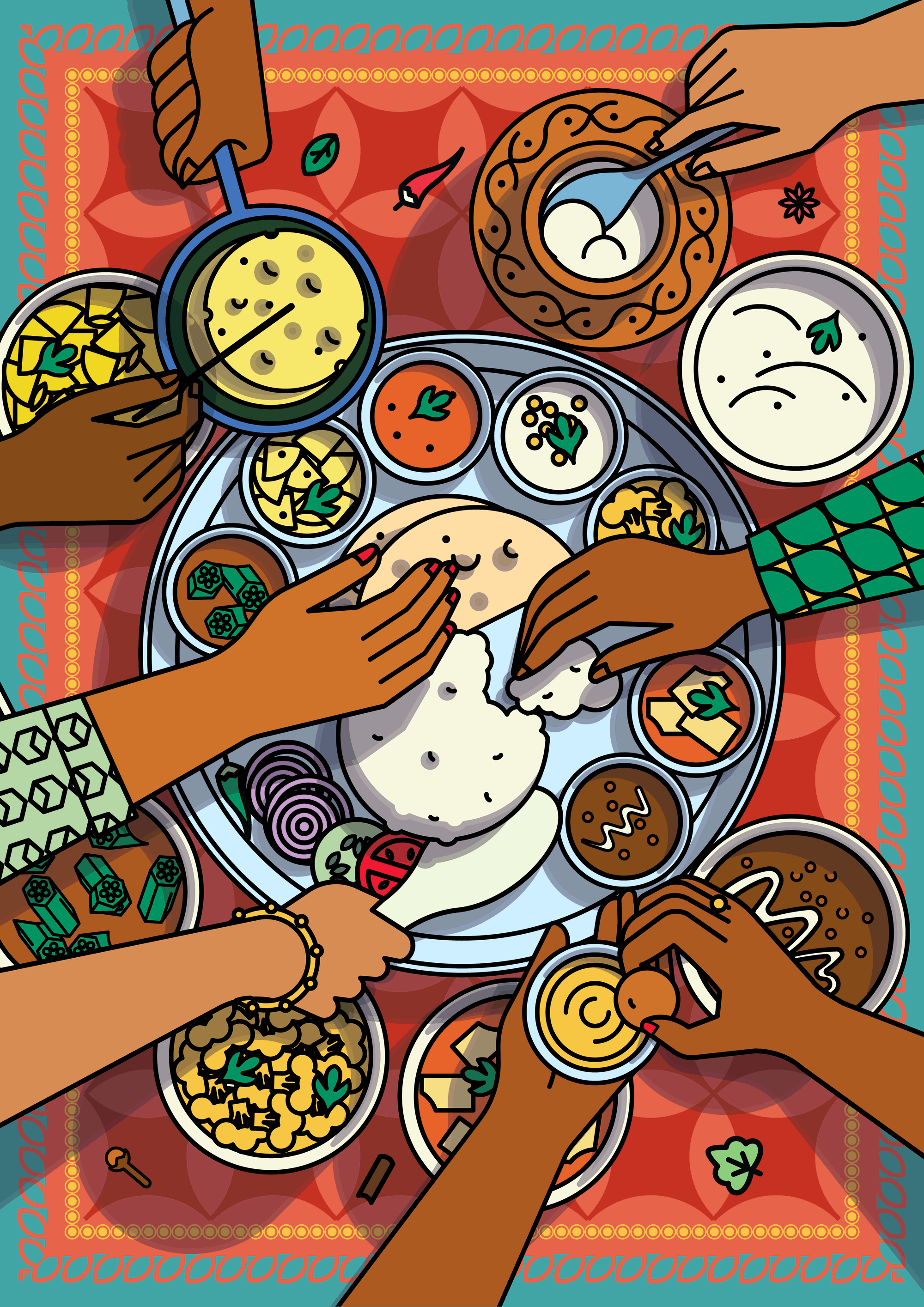
Thali
Aloo Parata


Credits:
Creative Director - Bob Surrao
Lead Designer - Swathi Ramaswamy
Jr. Designer - Mehar Kakkar
Sr. Illustrator - Vipin Das